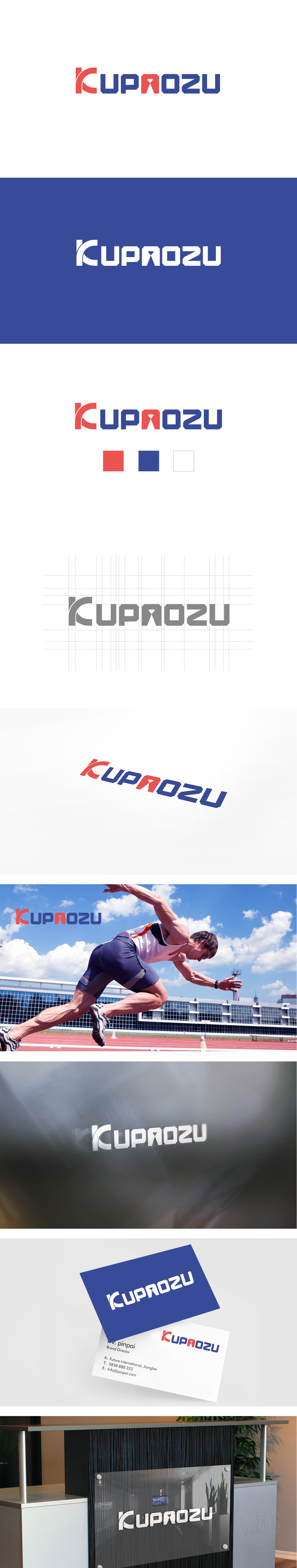
狮动设计采用倾斜与流线型结构 首字母“K”采用红色倾斜设计,竖笔如跑步时前伸的手臂或蹬地的腿部,斜线带有明显的“冲刺感”,打破静态平衡,视觉上呈现向前的爆发力,呼应跑步时的动态姿态。色彩与力量感:强化跑步的活力与能量。红蓝撞色的视觉冲击 红色(“K”“A”)象征激情、热血,对应跑步时的心率加速与能量释放;蓝色代表沉稳、专业,暗示科学运动与持久耐力,两者结合既体现跑步的爆发力,也兼顾运动的持久性。字型设计通过动态笔画、力量感结构、活力色彩的组合,将跑步的“动态、力量、活力”转化为可感知的视觉语言。
Lion design adopts inclined and streamlined structure, and the initial letter "K" adopts red inclined design. The vertical pen is like an arm that stretches forward or a leg that pushes the ground when running, and the diagonal line has obvious "sprint feeling", which breaks the static balance and visually presents forward explosive force, echoing the dynamic posture when running. Color and sense of strength: strengthen the vitality and energy of running. The visual impact of the contrast between red and blue Red ("K" and "A") symbolizes passion and blood, corresponding to the acceleration of heart rate and energy release during running.


扫码或拨打添加客服微信


