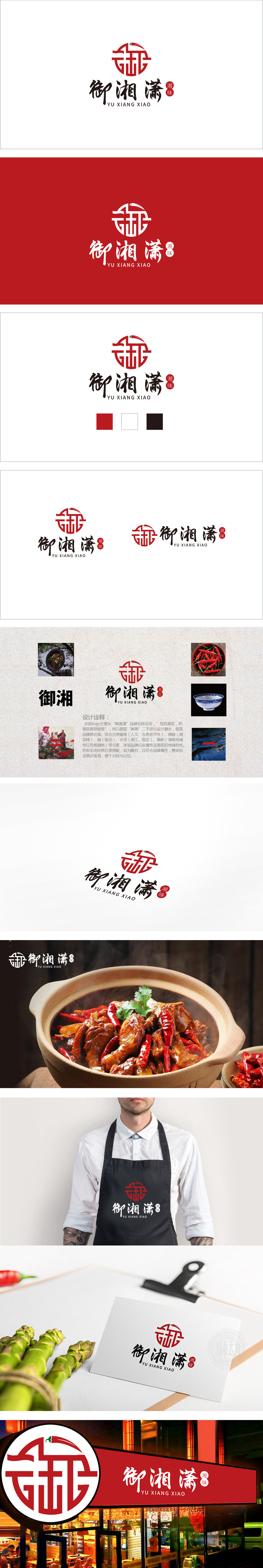
狮动设计以红色圆形为基底,嵌套变形的“御”字篆书结构,笔画通过曲直穿插形成类似传统“回纹”或“窗棂”的对称纹样,既保留了汉字的识别性,又通过线条的几何化处理增强了现代感。圆形轮廓象征圆满、团聚,符合餐饮品牌传递的温暖、包容气质。点睛元素:辣椒与“勺”的视觉融合,既点明“湘味”的核心属性,又通过辣椒蒂部的弯钩设计暗合“勺子”的形态,隐喻餐饮行业的“烹饪”与“品尝”场景,实现了食材、工具与文化符号的三重关联。从“文化符号(御)+ 行业符号(辣椒/勺)+ 情感符号(圆形)”三个维度构建了完整的视觉系统,既满足了餐饮品牌对“食欲刺激”“品类清晰”的基础需求,又通过汉字重构和传统纹样提升了文化溢价。
Lion design is based on a red circle, with a nested and deformed seal script structure of "Yu", and the strokes are interspersed with straight lines to form a symmetrical pattern similar to the traditional "palindrome" or "window lattice", which not only retains the recognition of Chinese characters, but also enhances the modern sense through the geometric treatment of lines. The circular outline symbolizes perfection and reunion, which conforms to the warmth and tolerance conveyed by catering brands. The finishing touch element: the visual fusion of pepper and spoon not only points out the core attribute of Hunan flavor, but also coincides with the shape of spoon through the hook design of pepper pedicle.


扫码或拨打添加客服微信


