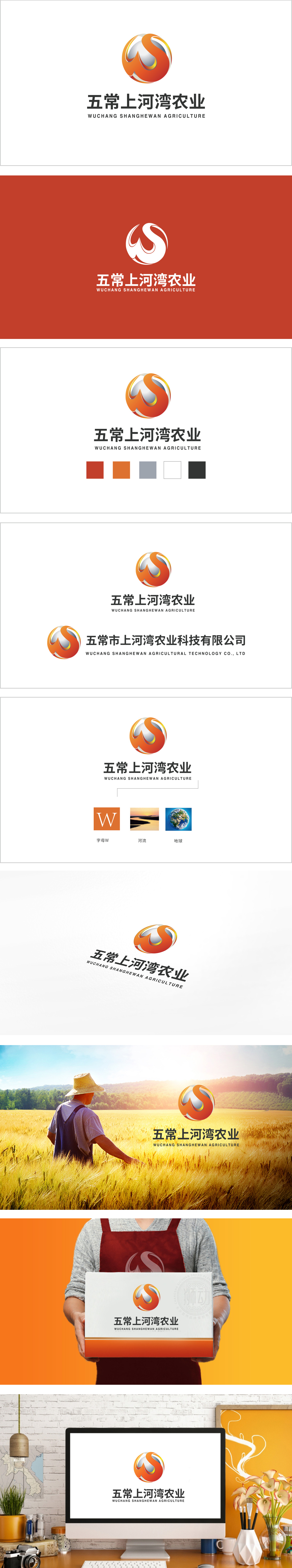
狮动设计以圆形为基底,内部由橙色、红色渐变的流线型曲线构成主体视觉符号。曲线的缠绕形态既像蜿蜒的河流,又通过顶部收窄、底部舒展的轮廓,抽象模拟了稻穗饱满垂落的姿态,精准关联“五常大米”这一核心农业产品,实现了“地域+产业”的双重视觉编码。圆形基底采用银灰渐变填充,通过明暗对比形成“球体”的视觉错觉,流线型曲线的“旋转缠绕”设计,赋予标志强烈的动态韵律,象征农业自然生命的循环,也传递出品牌积极向上、蓬勃发展的姿态:从直观上,一眼可辨“农业、水系、地域特色”;从深层看,传递出“生态滋养、科技赋能、品质至上”的品牌价值。
Lion is based on a circle, and the main visual symbol is composed of streamlined curves with gradual orange and red changes inside. The winding shape of the curve is not only like a winding river, but also through the outline of narrowing at the top and stretching at the bottom, which abstractly simulates the full and drooping posture of rice ears, accurately relates the core agricultural product "Wuchang Rice" and realizes the dual visual coding of "region+industry". The circular base is gradually filled with silver and gray, and the visual illusion of "sphere" is formed through the contrast between light and shade. The "rotating winding" design of streamlined curve gives the logo a strong dynamic rhythm, symbolizes the cycle of agricultural natural life.


扫码或拨打添加客服微信


