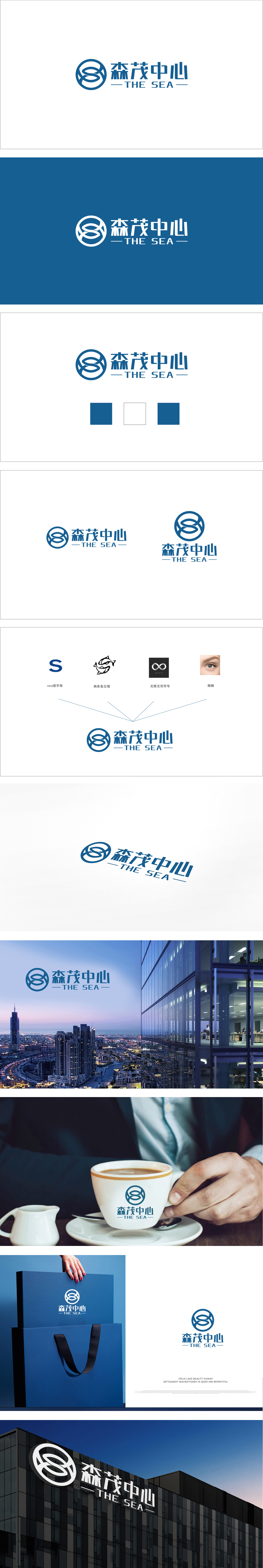
狮动团队深入挖掘项目内核,以海浪流动形态构建环形标识,抽象融合首字母强化记忆点;选取沉稳海洋蓝传递信任,英文“THE SEA”锚定地域与产业属性,让“生态、互联、势能”精准可视化。让品牌气质与高端商务体验无缝衔接”;尽显狮动“从战略到视觉的全维设计力”。
The Lion Movement team digs deep into the core of the project, constructs a circular logo in the form of wave flow, and abstracts and fuses initials to strengthen memory points; The calm ocean blue is selected to convey trust, and the English word "THE SEA" anchors the regional and industrial attributes, so that "ecology, interconnection and potential energy" can be accurately visualized.


扫码或拨打添加客服微信


