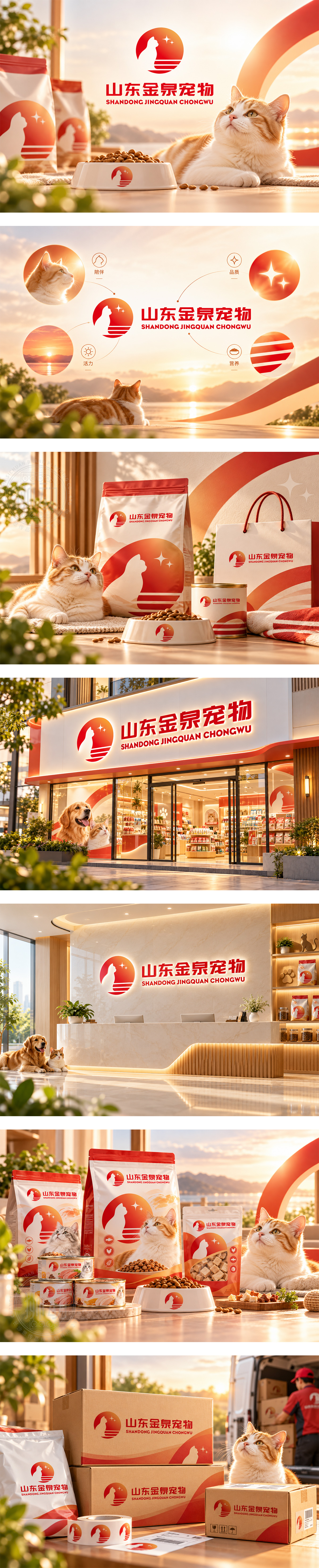
标志以红橙渐变圆日为底,融合猫咪剪影与“金泉”水纹,星芒点缀品质闪耀。猫影昂首传递宠物活力,波浪线条象征源头好水与滋养,呼应食品生产的安全纯净。红色调彰显品牌热情,字体稳重亲和。整体视觉诠释自然馈赠与关爱,展现企业专注宠物食品研发销售的温暖初心与卓越追求。
Set against a red-orange gradient sun, the logo blends a cat silhouette with flowing water waves and sparkling stars. The upright cat conveys vitality, while waves imply pure source nourishment, echoing safe food production. Warm red expresses passion, paired with stable typography. The design interprets nature’s gift and deep care, showcasing a warm original intention and excellent pursuit in pet food development and sales.




扫码或拨打添加客服微信