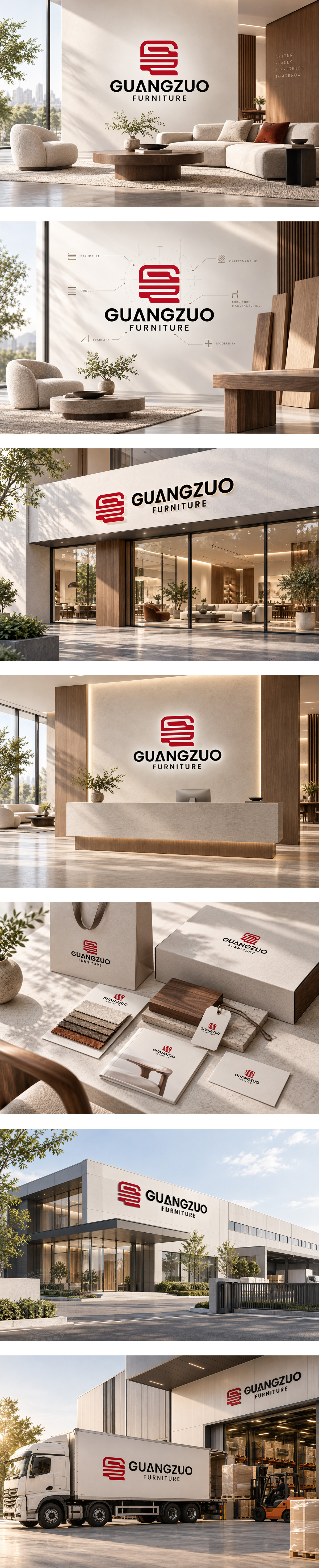
标志以“G”为形,层叠横线如板材肌理与榫卯层架,折转角线刚劲利落,隐喻结构稳固与现代制造精度。中国红传递匠心温度与品牌自信,黑色字标沉稳有力,整体兼具工业理性与居家质感,彰显广作家具对空间美学、功能秩序及品质匠造的持续追求。
Built from the letter “G,” layered horizontal strokes echo panel grain, joinery and shelving structure, while sharp turns express engineering precision and solid stability. Bold red radiates craft heritage and confidence; black typography adds industrial weight and modern calm. The mark unites manufacturing rigor with living-space warmth, reflecting a furniture maker dedicated to functional order, spatial aesthetics and enduring quality.




扫码或拨打添加客服微信


