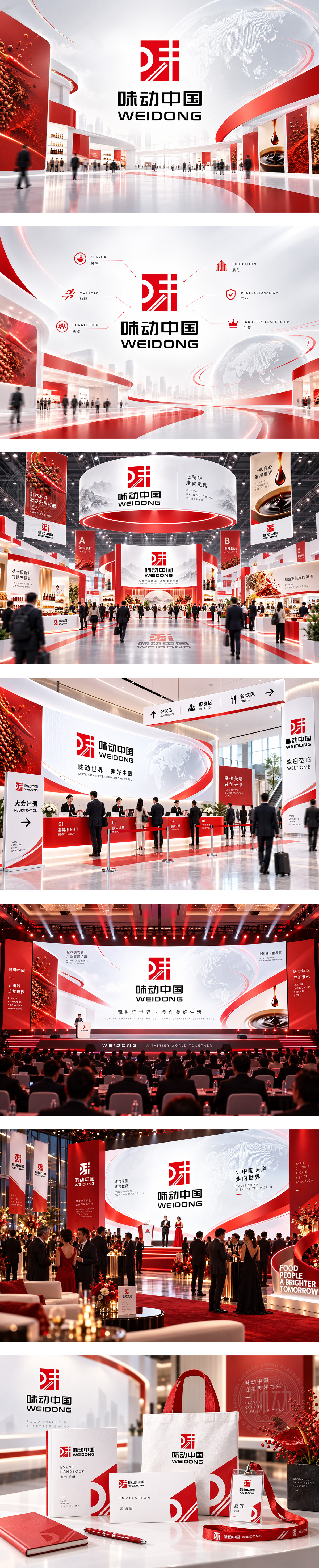
标志以“味”字意象解构,红色方块如味觉能量场,斜线似味型层次与产业脉动,传递调味品行业的浓郁活力与创新驱动。方正结构彰显展会专业权威,红色点燃品牌热度与东方食韵。整体简洁有力,承载“味动中国”聚合产业、引领趋势、打造行业第一品牌展的雄心与平台价值。
The mark deconstructs a taste-driven letterform inside a bold red block, where diagonal lines suggest layered flavors, flow and industry momentum. Red radiates culinary energy, passion and Eastern food heritage, while the square structure signals authority and professionalism. Clean and powerful, the identity positions a premier trade platform to unite, innovate and lead the condiment and seasoning sector.




扫码或拨打添加客服微信


