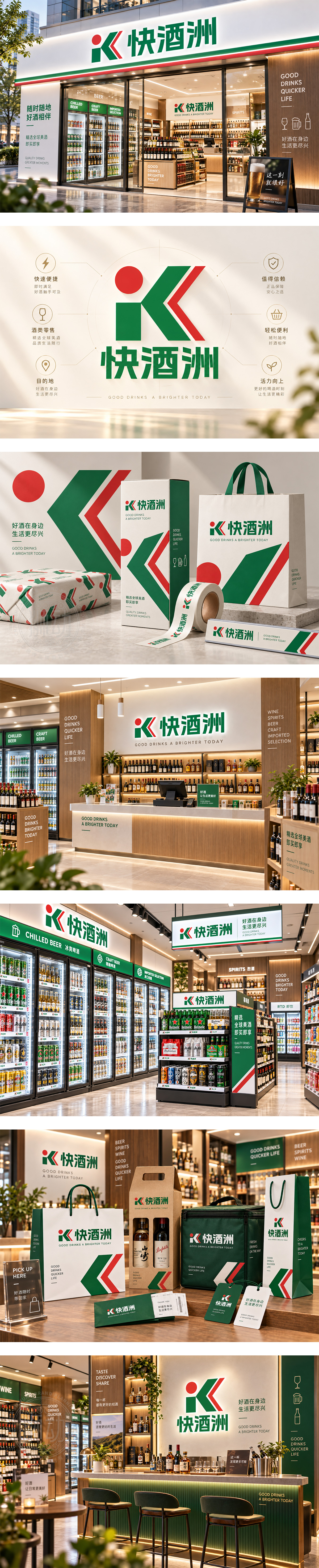
标志以“iK”为形,红点如酒液升腾,绿色块面稳重鲜活,红色折角传递快捷动势,整体似人形服务姿态,呼应“快酒洲”即时便利与亲和体验。色彩明快,识别直接,契合酒水便利店高效选品、轻松到手的新零售节奏,打造年轻化、可信赖的社区酒水补给站形象。
The mark shapes “iK” with a red dot like a drop of spirit and green forms suggesting freshness and stability. The red angular slash adds speed and direction, while the human-like posture implies friendly service. Bold, clear and energetic, the identity fits a liquor convenience store—fast pickup, easy access, and a youthful neighborhood stop for drinks.




扫码或拨打添加客服微信


