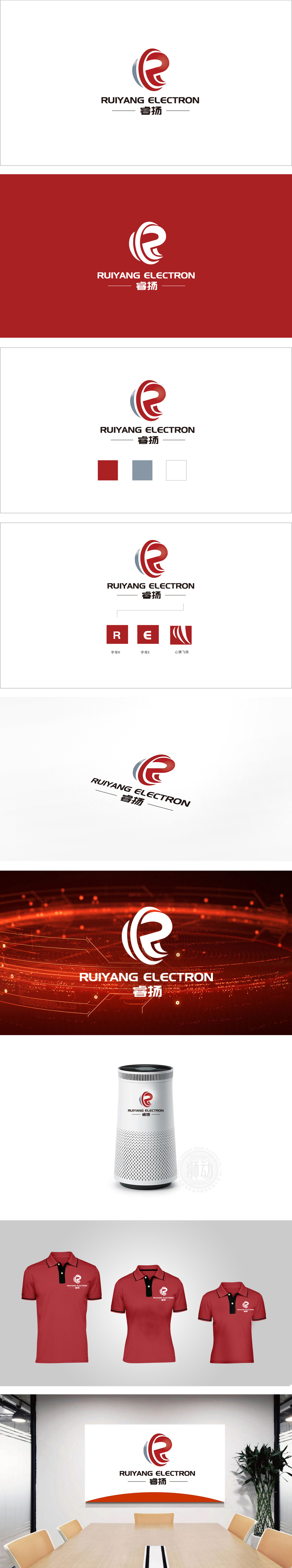
狮动设计以字母“R”为创意原点,通过红色主调与流畅的曲线造型,赋予图形强烈的动态感,红色既传递科技行业的活力与创新,暗含品牌“热情、可靠”的特质;曲线的环绕与收尾的上扬设计,既像环绕的电子信号,又似抽象的“飞扬”姿态,与中文“睿扬”的“扬”字形成语义与视觉的双重呼应,强化了“积极向上、锐意进取”的品牌联想。用一个核心图形符号串联起行业属性、品牌名称(睿扬)、价值主张(创新、飞扬),传递出“专业、精准”的技术基因。
Lion design takes the letter "R" as the creative origin, and gives the graphics a strong sense of dynamic through the red theme and smooth curve modeling. Red not only conveys the vitality and innovation of the technology industry, but also implies the characteristics of the brand "enthusiasm and reliability"; The rising design of the winding and ending of the curve, like both the surrounding electronic signal and the abstract "flying" gesture, forms a double semantic and visual echo with the Chinese word "Yang" and strengthens the brand association of "positive and enterprising". A core graphic symbol is used to connect the industry attribute.


扫码或拨打添加客服微信


