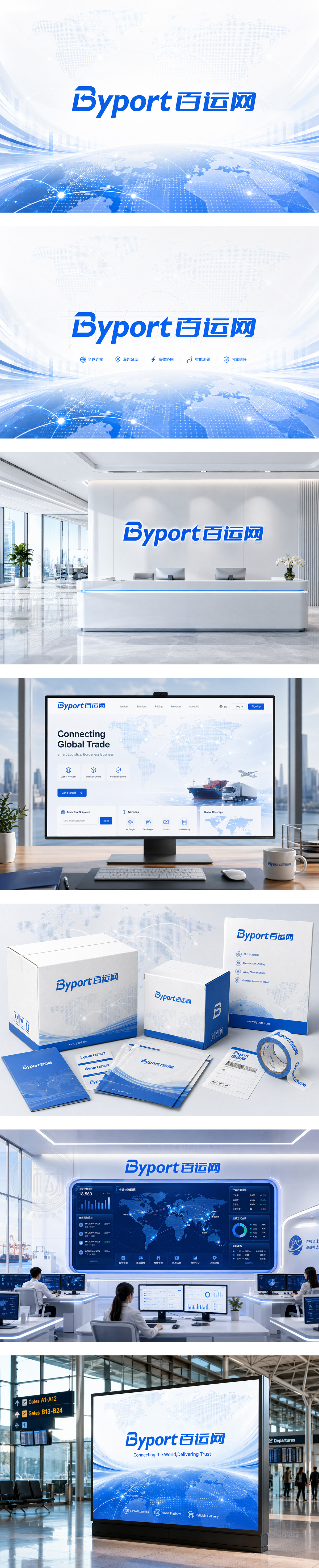
标志以科技蓝为主色,传递高效、信任与全球互联。字母“B”嵌入回环箭头,象征物流双向流转与信息闭环;“port”呼应港口枢纽与海外站点属性。中英字标连贯一体,倾斜动势如速达轨迹,体现跨境运输的敏捷与稳定。整体塑造专业、开放、智能化的国际物流服务平台形象。
Tech-blue color expresses efficiency, trust and global connectivity. The “B” integrates a loop arrow, symbolizing two-way logistics flow and seamless information exchange. “Port” implies hub connectivity and overseas presence. The unified wordmark with forward tilt suggests speed and stable delivery. The identity presents a professional, open and intelligent platform for cross-border logistics.




扫码或拨打添加客服微信


