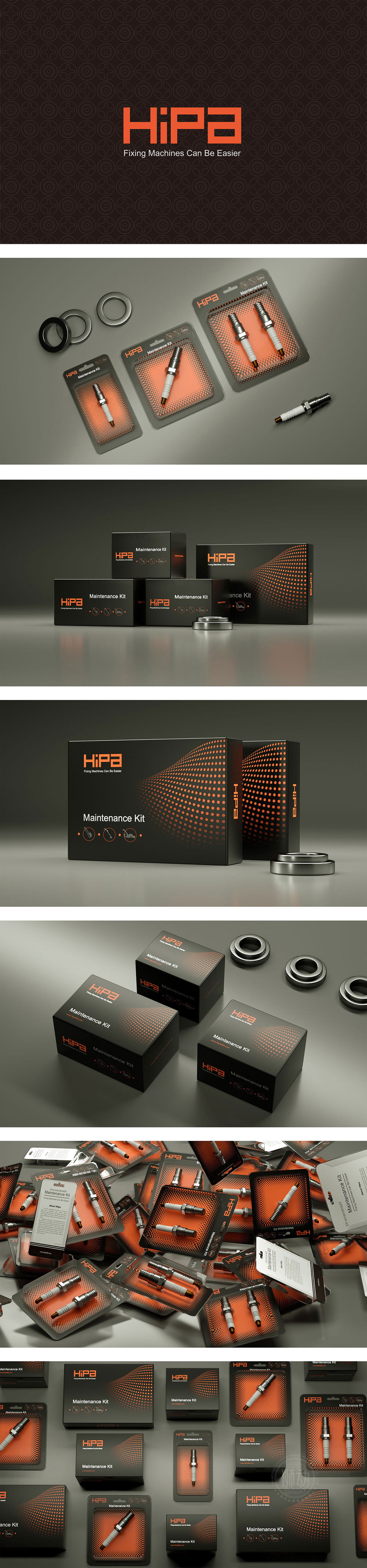
狮动设计采用波浪形点状渐变图案是点睛之笔——从密到疏的橙色圆点,模拟了“流动”或“能量传递”的视觉效果,既打破了纯黑盒子的单调,又呼应了“让维修更轻松”的品牌标语;同时,点状图案与左侧盒子的线性图标形成“点线对比”,让整体画面更有节奏。黑+橙的经典撞色组合,黑色作为主色,自带专业、可靠、高级的属性,完美契合“维护套件”这类需要传递“值得信赖”的工具产品;传递“可靠、高效、现代”的产品属性。
The wavy dot gradient pattern used in Lion Motion design is the crowning touch-orange dots from dense to sparse, which simulates the visual effect of "flow" or "energy transfer", which not only breaks the monotony of pure black box, but also echoes the brand slogan of "making maintenance easier". At the same time, the dot pattern and the linear icon on the left box form a "dotted line contrast", which makes the whole picture more rhythmic. The classic contrast color combination of black and orange, with black as the main color, comes with professional, reliable and advanced attributes.


扫码或拨打添加客服微信


