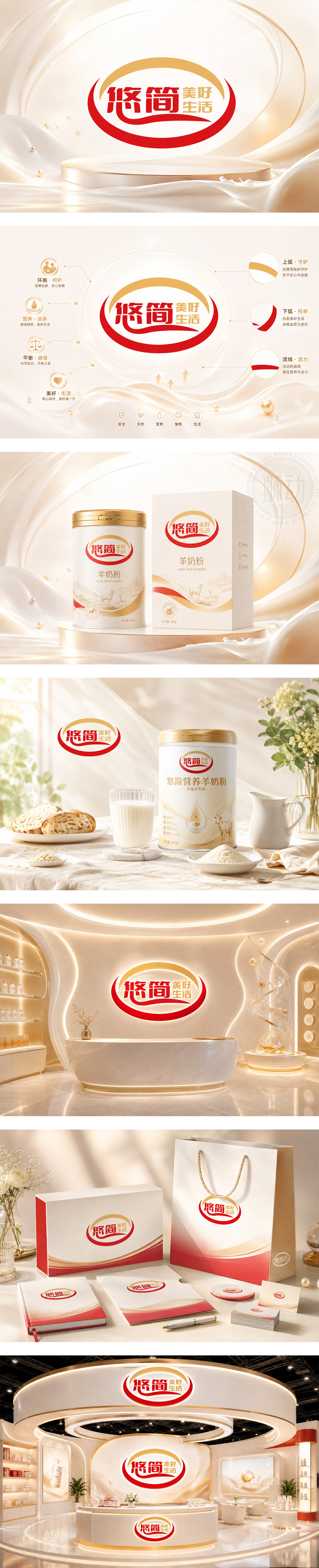
标志以红金配色为主,象征健康活力与尊贵品质。外部的弧形线条宛如温暖的怀抱与微笑,传递出品牌对消费者的贴心呵护与守护,寓意“美好生活”的全方位滋养。字体设计圆润亲和,“悠简”二字寓意悠然自得、简约健康的生活方式。整体视觉温暖积极,精准契合保健营养品行业属性,传达出品牌致力于为大众提供轻松、高效的健康解决方案,守护每一个家庭的幸福安康。
The logo features a red and gold palette, symbolizing health, vitality, and premium quality. The surrounding arc lines resemble a warm embrace and a smile, conveying thoughtful care and all-around nourishment for a better life. The rounded, friendly typography implies a relaxed and simple healthy lifestyle. The overall visual is warm and positive, perfectly matching the healthcare supplement industry. It communicates the brand's commitment to providing easy and effective health solutions, safeguarding the happiness of every family.




扫码或拨打添加客服微信


