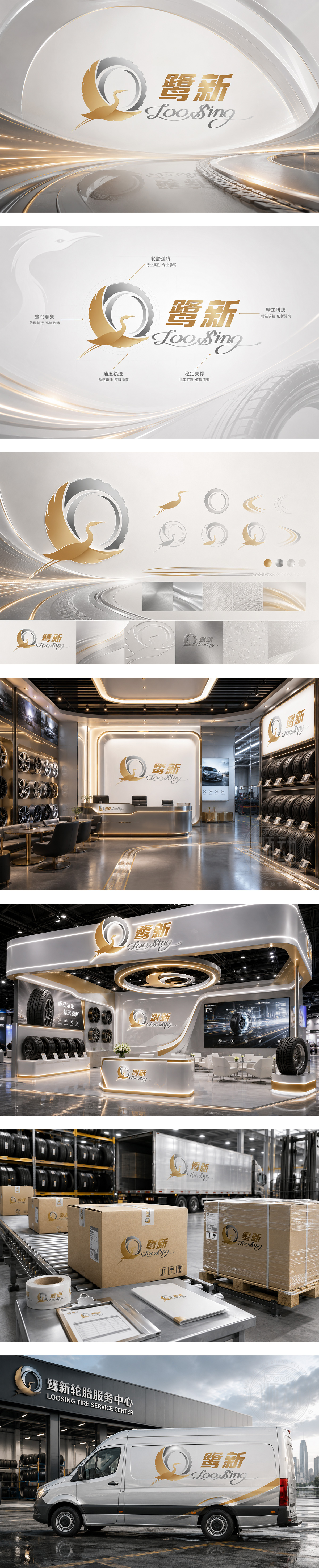
标志巧妙融合“鹭鸟”与“轮胎”意象。金色鹭鸟展翅高飞,象征品牌高瞻远瞩、稳健前行;银色轮胎弧线代表行业属性,寓意承载与速度。图形下方的流线型轨迹传达动感与突破。金/银配色彰显高端品质与精工科技。“鹭新”寓意如白鹭般纯洁可靠,不断创新。整体设计传递出汽配轮胎企业安全、专业、引领未来的品牌形象。
The logo integrates an egret and a tire. The golden egret in flight symbolizes foresight and steady progress, while the silver tire arc represents the industry, implying load-bearing and speed. The streamlined trail below conveys dynamics and breakthrough. The gold and silver palette highlights premium quality and technology. "Loosing" implies reliability and innovation. The design conveys a brand image of safety, professionalism, and a forward-looking future in the auto parts sector.




扫码或拨打添加客服微信


