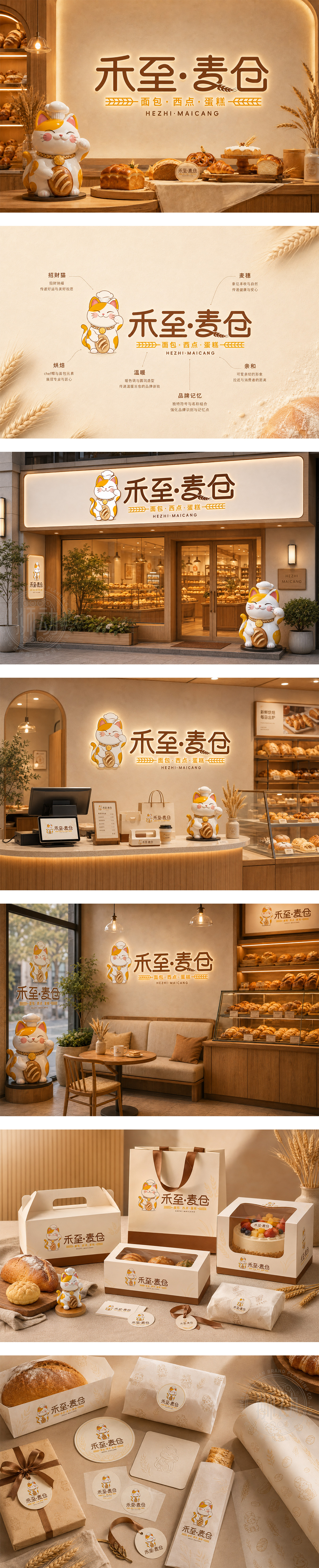
标志以卡通招财猫为主角,头戴厨师帽、怀抱法棍面包,既点明烘焙行业属性,又寓意招财进宝、客源广进。暖橙色与咖啡棕的色彩搭配,传递出麦香浓郁、温暖治愈的食欲感。字体设计圆润饱满,“禾至·麦仓”结合麦穗元素,强调天然原料与匠心工艺。整体风格萌趣可爱,极具亲和力,精准锁定家庭与年轻客群,塑造出兼具美味与好运的烘焙品牌形象。
The logo features an adorable lucky cat wearing a chef's hat and holding a baguette, clearly defining the bakery sector while symbolizing prosperity and good fortune. The warm orange and coffee brown palette evokes a sense of wheat aroma, warmth, and appetite. The rounded typography, integrated with wheat ear motifs, emphasizes natural ingredients and craftsmanship. With a cute and friendly style, the design targets families and young customers, building a bakery brand that combines delicious treats with auspicious blessings.




扫码或拨打添加客服微信
