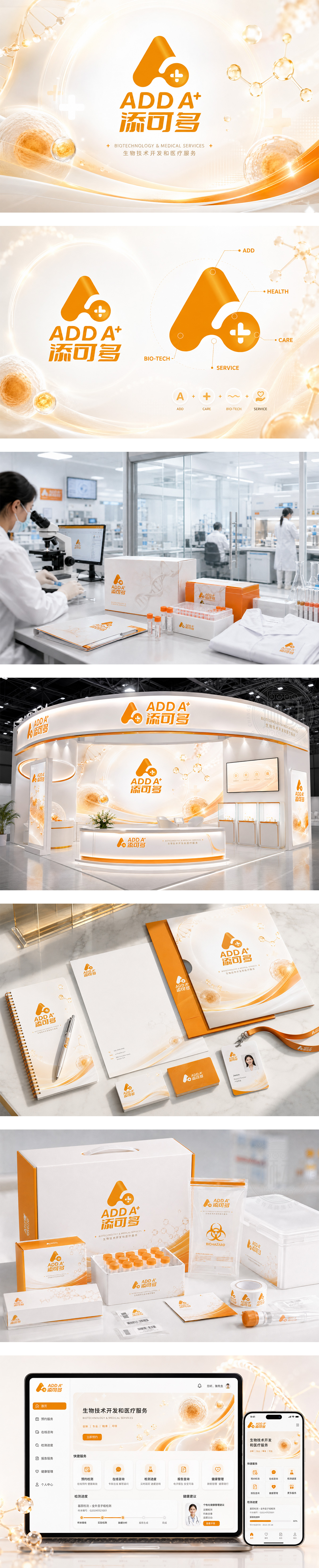
标志以活力橙为主色调,左侧图形融合“A”字母与“+”符号,象征生物医疗领域的“添加、增值、升级”,亦如细胞或分子结构,传递科技感与生命力。右侧“ADD A⁺”与“添可多”字体现代流畅,强化品牌识别。整体视觉简洁有力,寓意“为生命健康添动力、可无限拓展”,契合精准医疗、营养干预、生物创新等核心业务方向。
The logo uses vibrant orange — the left icon merges “A” and “+” to symbolize “addition, enhancement, and scalability,” resembling cellular or molecular structures for scientific vitality. “ADD A⁺” and its Chinese counterpart use clean, modern typography for strong brand recall. Visually minimal yet powerful, it conveys “adding value to life, expanding possibilities” — perfectly aligned with precision medicine, nutritional science, and biotech innovation.




扫码或拨打添加客服微信


