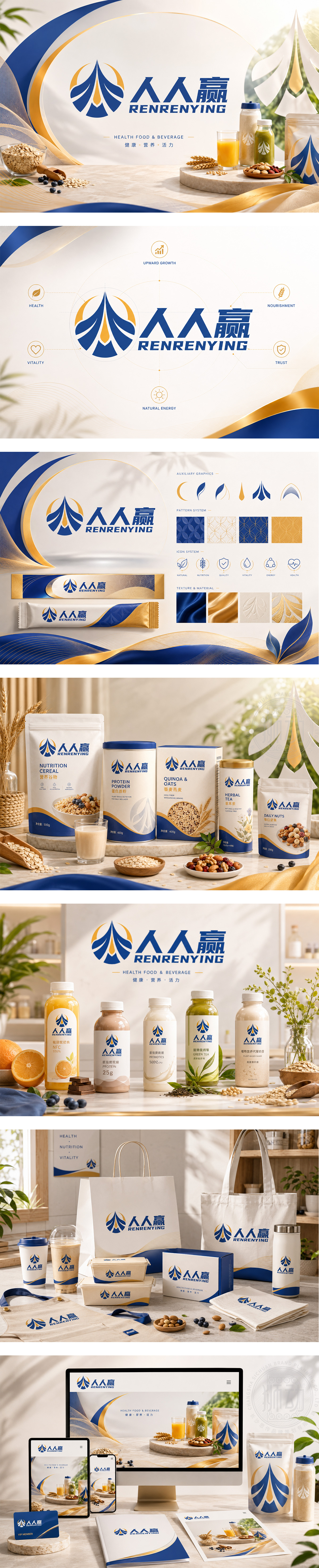
标志以抽象人形与飞鸟羽翼融合成圆形图腾,深蓝主色传递专业与健康信赖,橙色点缀象征活力与能量。图形寓意“人人参与、共同向上”,呼应“人人赢”品牌名,传递“健康共享、共赢生活”的理念。字体稳重有力,中英文结合强化品牌识别。整体设计现代简洁,兼具亲和力与力量感,契合健康食品饮品“全民健康、活力生活”的核心价值。
The logo merges abstract human forms with soaring wings into a circular emblem — deep blue conveys professionalism and health trust, while orange accents add vitality. The design embodies “everyone rises together,” echoing the brand name “RENRENYING.” Typography is bold and balanced, reinforcing recognition. Modern and clean, it blends approachability with strength — perfectly aligning with the core value of healthy food & beverage: “Health for all, vitality for life.”




扫码或拨打添加客服微信


