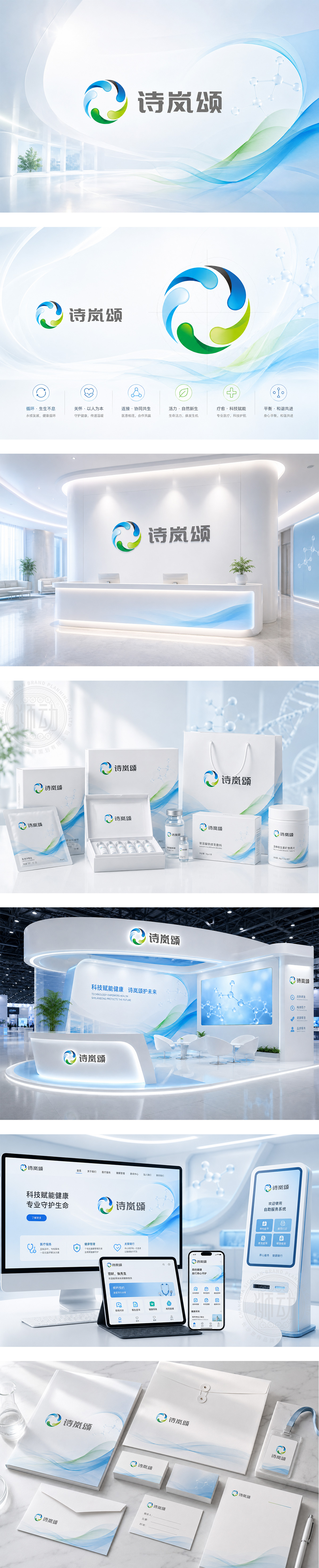
标志由蓝、绿、灰三色流动弧线构成环形,象征生命律动与医患共融。蓝色代表科技与信任,绿色寓意健康与希望,灰色体现专业与稳重。环形结构暗含“循环守护、全域关怀”的医疗理念,下方“诗岚颂”字体沉稳现代,传递品牌人文温度。整体设计柔和而有力,契合医疗行业“以人为本、科学疗愈”的核心价值,塑造值得信赖的健康伙伴形象。
The logo features flowing arcs in blue, green, and gray forming a circle — symbolizing life rhythm and patient-care harmony. Blue stands for technology and trust; green, health and hope; gray, professionalism and stability. The circular form implies holistic care and continuous protection. “Shi Lan Song” below is rendered in calm, modern typography, conveying human warmth. Soft yet strong, it aligns with healthcare’s core: “People-centered, science-driven healing” — building a trusted health partner image.




扫码或拨打添加客服微信


