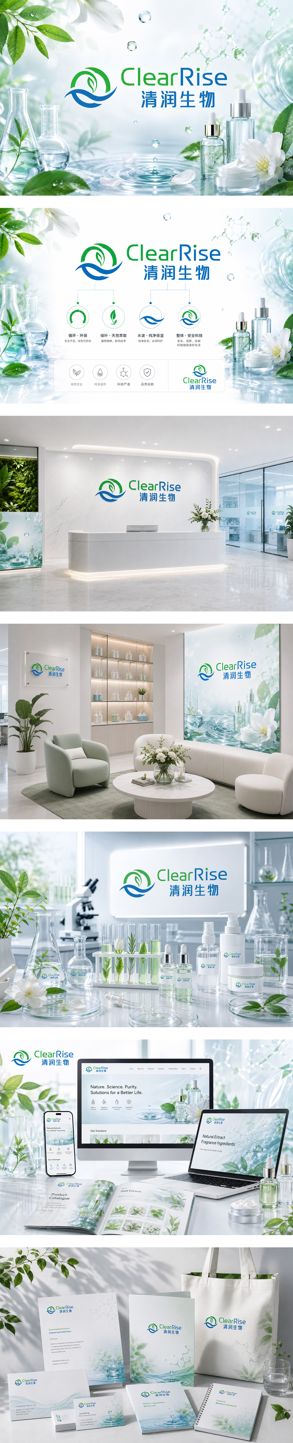
标志以绿叶与水波为核心图形,绿色叶片象征天然萃取与植物精华,蓝色水波代表纯净水源与温和工艺,二者交融寓意“清润”之本。下方“ClearRise”采用绿蓝双色字体,呼应自然与科技;“清润生物”稳重清晰,传递专业信赖。整体设计清新灵动,诠释品牌“从自然中提取,为日化赋能”的理念,强调安全、纯净与可持续。
The logo combines a green leaf and blue wave — leaf for natural extraction and botanical essence, wave for pure water and gentle processing. Their fusion embodies “ClearRise” — clarity and growth. “ClearRise” in dual-tone green-blue mirrors nature and technology; “Qingrun Bio” below adds professional credibility. Clean, dynamic, and eco-conscious, it communicates: “Extract from nature, empower daily care” — emphasizing safety, purity, and sustainability.




扫码或拨打添加客服微信


