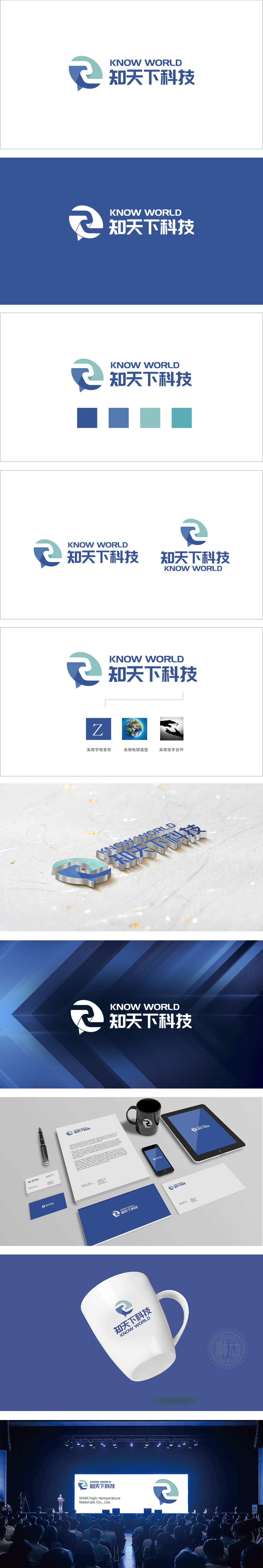
狮动设计以两个半弧形与字母“Z”的变形融合而成,整体呈“对话气泡”的轮廓,巧妙呼应“知”(知识传递)与“天下”(开放沟通)的品牌内涵。浅蓝绿色,象征科技感与创新;深蓝色,传递专业与稳重,冷暖色过渡自然,增强层次感。科技属性:线条的几何感、色彩的冷静感,以及“信息流动”的隐喻,精准匹配科技公司的行业定位,有效传递了“连接世界”的理念,知识型科技企业的专业形象与愿景。
Lion design is a fusion of two and a half arcs and the letter "Z", and the overall outline is a "dialogue bubble", which cleverly echoes the brand connotations of "knowledge" (knowledge transfer) and "world" (open communication). Light blue and green, symbolizing the sense of science and technology and innovation; Dark blue conveys professionalism and stability, and the transition between cold and warm colors is natural, enhancing the sense of hierarchy. Scientific and technological attributes: the geometric sense of lines, the calm sense of colors and the metaphor of "information flow" accurately match the industry positioning of scientific and technological companies.


扫码或拨打添加客服微信


