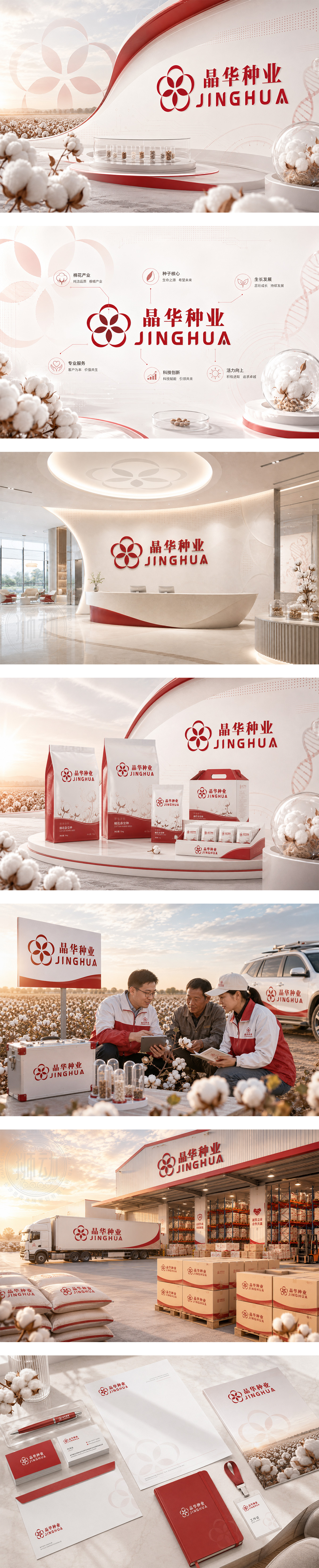
标志以红色五瓣花形为核心,象征棉种绽放与生命繁衍,亦暗合“晶华”首字母“J”与“H”的交融结构,体现科技与自然的共生。花瓣环抱中心,寓意自主研发、生产、营销与技术服务四位一体的闭环生态。红色传递活力与信赖,下方“晶华种业 JINGHUA”中英文字体稳重清晰,强化品牌专业形象。整体设计兼具农业根基与科技感,诠释“以科技育良种,以匠心护丰收”的企业使命。
The logo features a red five-petal bloom — symbolizing cotton seed vitality and life cycles, while subtly integrating the letters “J” and “H” for “Jinghua”. Petals encircling the center reflect an integrated ecosystem of R&D, production, marketing, and tech services. Red conveys energy and trust; below, “JINGHUA” in clean typography reinforces professionalism. Blending agricultural roots with technological precision, it embodies the mission: “Nurturing superior seeds through innovation, safeguarding harvests with craftsmanship.”




扫码或拨打添加客服微信


