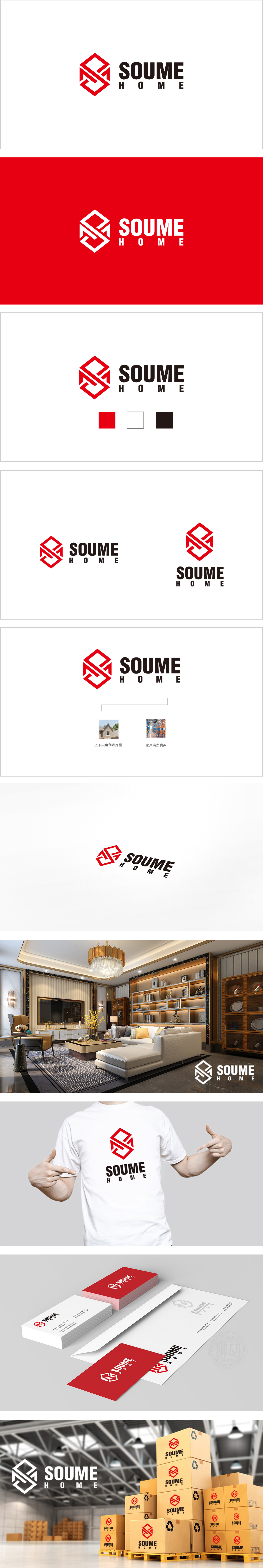
狮动设计采用正六边形作为基础图形,既传递出稳定、对称的视觉感受,又通过棱角线条体现科技感与现代感,打破传统家居品牌的柔和印象,暗示“科技赋能生活”的理念。字母“SM”的隐藏设计:“图形即字母”的设计既简洁易记,又增强了品牌识别的独特性,大红色图形象征活力、创新,与黑色文字形成强烈视觉冲击,吸引注意力,又通过红色的“点睛”效果强化品牌记忆点。布局传递出“家”的舒适与开放感,与主标题的紧凑形成节奏对比,平衡了“科技”与“生活”的双重属性,“用科技简化生活,用设计温暖空间”的理念。
Lion design uses regular hexagon as the basic graphic, which not only conveys a stable and symmetrical visual feeling, but also reflects the sense of science and technology and modernity through angular lines, breaking the soft impression of traditional home brands and implying the concept of "technology empowers life". The hidden design of the letter "SM": The design of "the figure is the letter" is simple and easy to remember, and it also enhances the uniqueness of brand recognition. The big red figure symbolizes vitality and innovation, which forms a strong visual impact with black characters, attracts attention, and strengthens the brand memory point through the red "finishing touch" effect.


扫码或拨打添加客服微信


