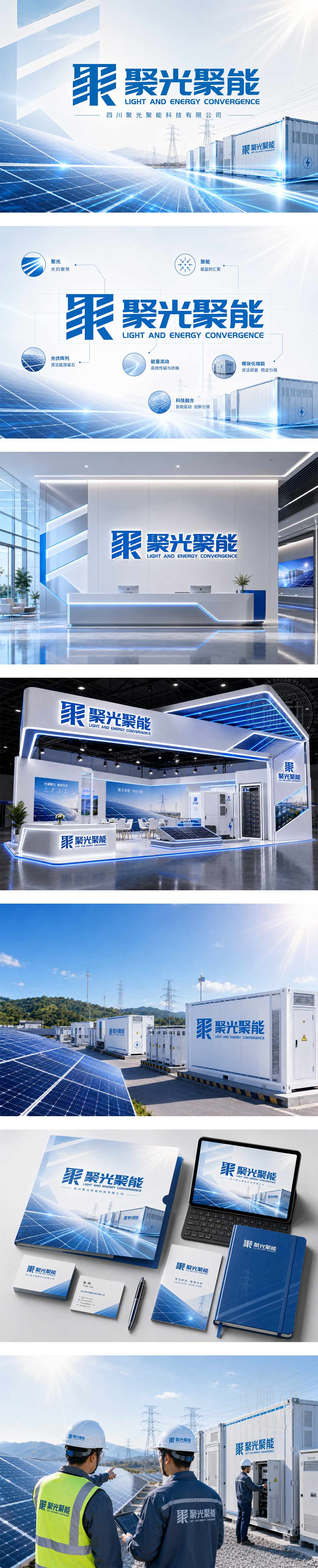
标志以“聚”字为核心视觉,通过几何切割与线条重组,形成对称、稳重的抽象图形,象征光伏与储能技术的高度集成与能量汇聚。蓝色主调传递科技、清洁能源与信赖感;倾斜的平行线条隐喻光线聚焦与电流传导,体现“光→电→储”的转化过程。下方“聚光聚能”四字强化品牌使命,英文副标“LIGHT AND ENERGY CONVERGENCE”精准传达业务本质。整体设计简洁有力,兼具工业美感与未来感,完美契合新能源行业的专业形象与创新精神。
The logo centers on the Chinese character “聚” , reimagined as a symmetrical, geometric abstraction — symbolizing the convergence of light and energy in PV and storage systems. The dominant blue conveys technology, clean power, and trust. Angled parallel lines suggest focused sunlight and electrical flow, visualizing the “light-to-electricity-to-storage” process. Below, the bold Chinese typography reinforces the brand’s mission, while the English tagline “LIGHT AND ENERGY CONVERGENCE” clearly defines its core business. Clean, industrial, and forward-looking, this design embodies innovation, efficiency, and sustainability — perfectly aligned with the new energy sector’s identity and values.




扫码或拨打添加客服微信


