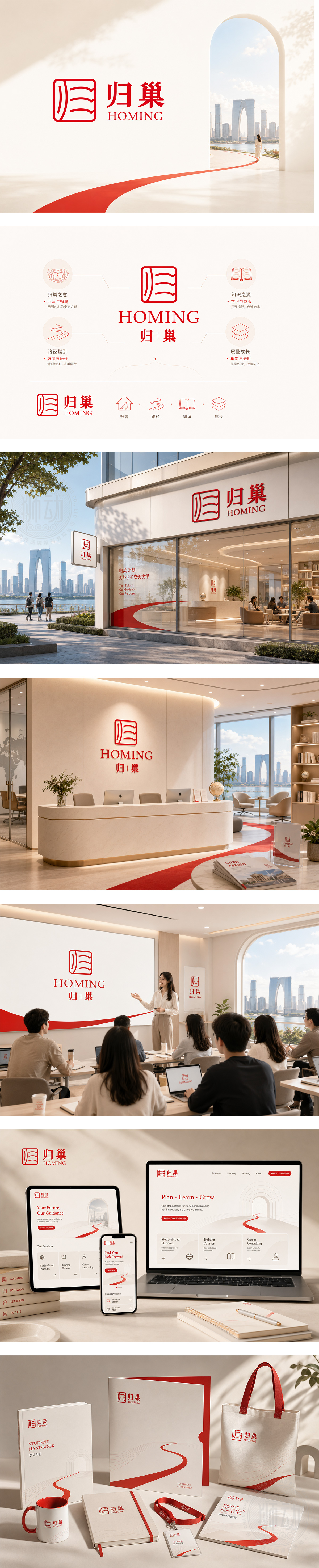
标志以朱砂红为主色,传递温暖、归属与文化认同。左侧图形巧妙融合“归”字篆书结构与巢形轮廓,象征游子归家、安心扎根;右侧“归巢”二字稳重有力,“HOMING”英文呼应国际化定位。整体设计兼具东方美学与现代简约,精准传达为留学生提供升学、求职、培训等一站式服务的核心价值——让异国求学之路,有方向、有陪伴、有归属。
The logo uses vermilion red to evoke warmth, belonging, and cultural identity. The left icon merges the seal-script form of “Gui” (Return) with a nest silhouette — symbolizing students finding home away from home. “HOMING” in clean sans-serif type reinforces global accessibility. Blending Eastern aesthetics with modern minimalism, it clearly positions the brand as a trusted companion for international students — offering academic, career, and training support to turn uncertainty into confidence and connection.




扫码或拨打添加客服微信


