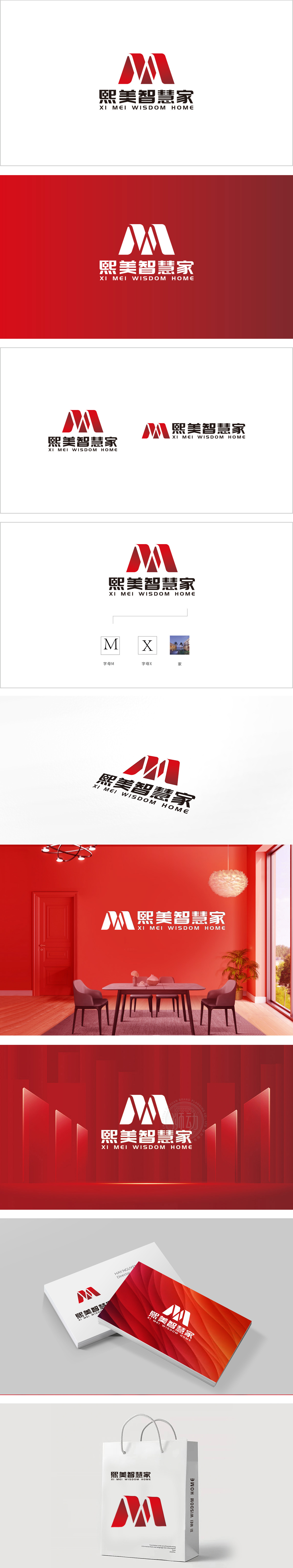
狮动设计采用字母与图形的双重解读,双“M”对称叠加,形成类似“屋顶”或“房屋轮廓”的抽象形态,暗合“智慧家”的“家”属性,传递居住空间的安全感与温馨感。动态与力量感: 倾斜切割,线条锐利且富有张力,打破对称图形的静态感,赋予标志“向上生长”的视觉联想,通过“图形(家+智慧)+色彩(温暖+活力)+文字(家+科技)”的组合,精准传递“熙美智慧家”的核心定位——以科技为内核,以“家”为场景,提供温暖、智能、创新的家居解决方案。
Lion design adopts the double interpretation of letters and figures, and the double "M" is symmetrically superimposed, forming an abstract form similar to "roof" or "house outline", which coincides with the "home" attribute of "smart home" and conveys the sense of security and warmth of living space. Sense of dynamic and strength: oblique cutting, sharp and full of tension, breaks the static sense of symmetrical graphics, endows the logo with visual association of "upward growth", and accurately conveys the core positioning of "Ximei Wisdom Home" through the combination of "graphics.


扫码或拨打添加客服微信


