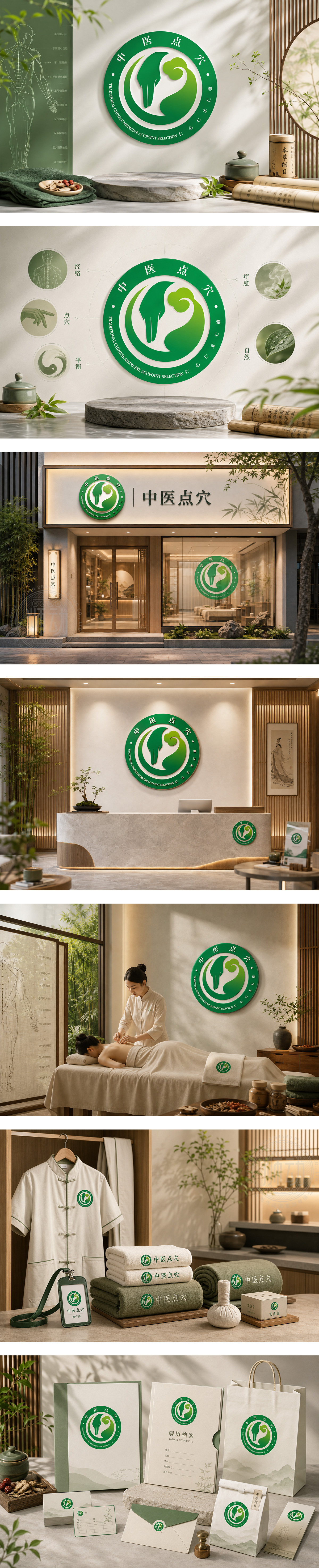
标志以绿色圆形为主体,象征自然、健康与循环。中央图案融合“手形”与“太极阴阳”意象,寓意中医点穴的精准与调和之道;右侧云纹增添传统韵味。外圈文字“中医点穴”与英文“TRADITIONAL CHINESE MEDICINE ACUPOINT SELECTION”环绕呼应,体现专业与国际化。整体设计温润和谐,传递“仁心仁术、自然疗愈”的品牌理念,塑造可信赖的传统中医理疗形象。
The logo features a green circular frame symbolizing nature, wellness, and balance. At its center, a stylized hand merges with yin-yang curves — embodying precision and harmony in acupoint therapy. A cloud motif adds traditional aesthetic depth. Outer ring text reinforces professionalism and global reach. Soft gradients and organic shapes convey “Healing Through Balance” — a trusted TCM brand rooted in compassion, tradition, and natural care.




扫码或拨打添加客服微信


