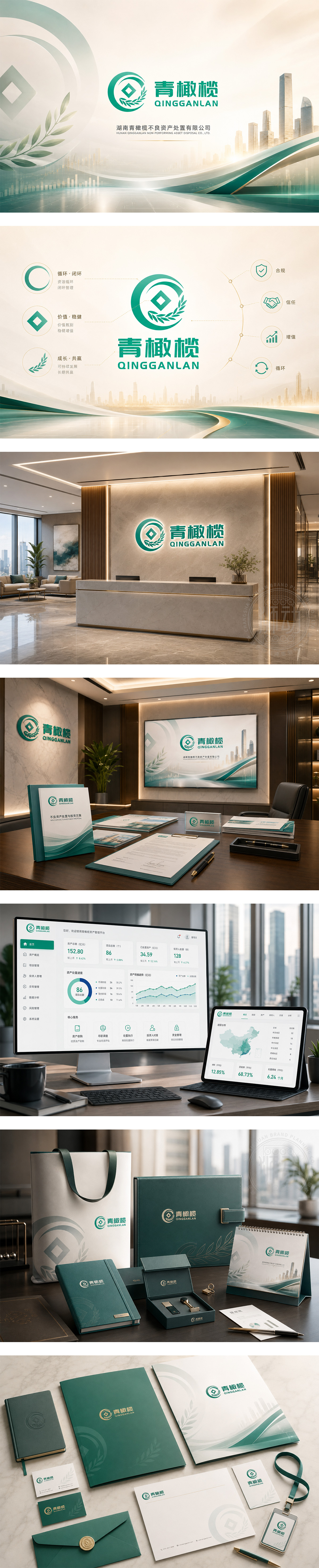
标志以圆形为基底,象征循环与闭环处置流程;中心菱形内嵌“Q”形结构,既代表“青橄榄”首字母,亦隐喻金融资产的“核心重组”与“价值重塑”。左侧弧线如叶片舒展,搭配右侧文字,传递绿色金融与可持续发展的理念。整体采用渐变青绿色调,清新而不失专业,契合不良资产处置中“化危为机、盘活资产”的核心诉求。图形简洁有力,视觉亲和,适用于金融机构、资产管理公司及风险化解服务平台,彰显理性、可信赖与生态友好的品牌形象。
The logo features a circular frame symbolizing closed-loop asset disposal, with a diamond-shaped “Q” at its core — representing both “Qingganlan” and the restructuring of financial assets. Left arc mimics a leaf, paired with text to convey green finance values. Gradient teal-green palette balances professionalism with approachability, reflecting the mission: “turning risk into value”. Clean, scalable design suits asset management firms and risk-resolution platforms — projecting trust, clarity, and ecological responsibility.




扫码或拨打添加客服微信


