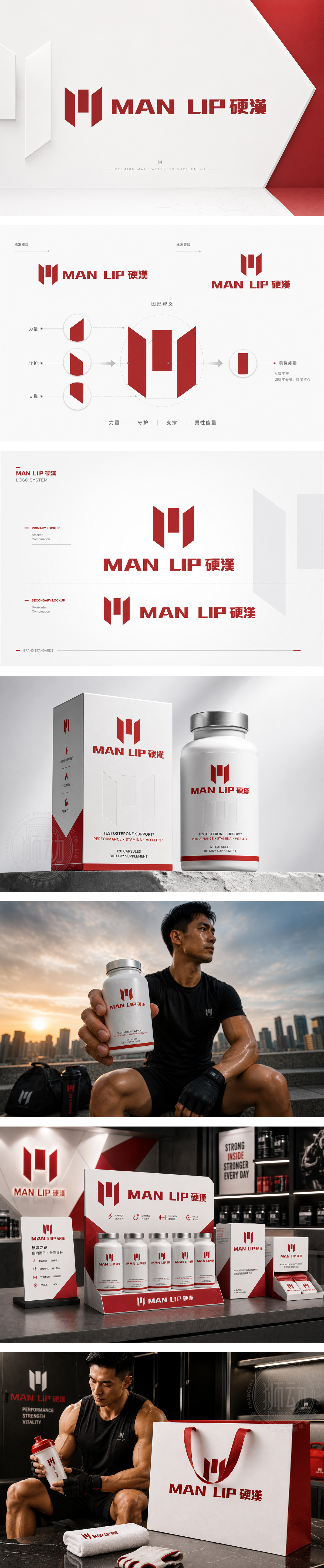
标志以“MAN UP 硬汉”为核心,图形由三个红色竖向几何块构成,巧妙融合了字母“M”与汉字“硬”的意象,象征男性力量的凝聚与爆发。深红色调传递出热血、激情与可靠的品牌气质,方正硬朗的线条呼应“硬汉”精神,传递出坚韧、自信与掌控力。中英文字体粗壮有力,强化视觉冲击力,整体设计充满阳刚之气与现代感,精准契合男性保健产品强调力量、健康与自我突破的品牌诉求。
Centered on "MAN UP," the logo uses three vertical red geometric blocks to form the letter "M" and imply the Chinese character, symbolizing the convergence and release of male strength. The deep red hue conveys passion, energy, and reliability, while the bold, angular lines echo the spirit of resilience and confidence. The strong typography reinforces visual impact, perfectly aligning with the brand’s focus on masculinity, health, and personal empowerment in men’s wellness products.




扫码或拨打添加客服微信


