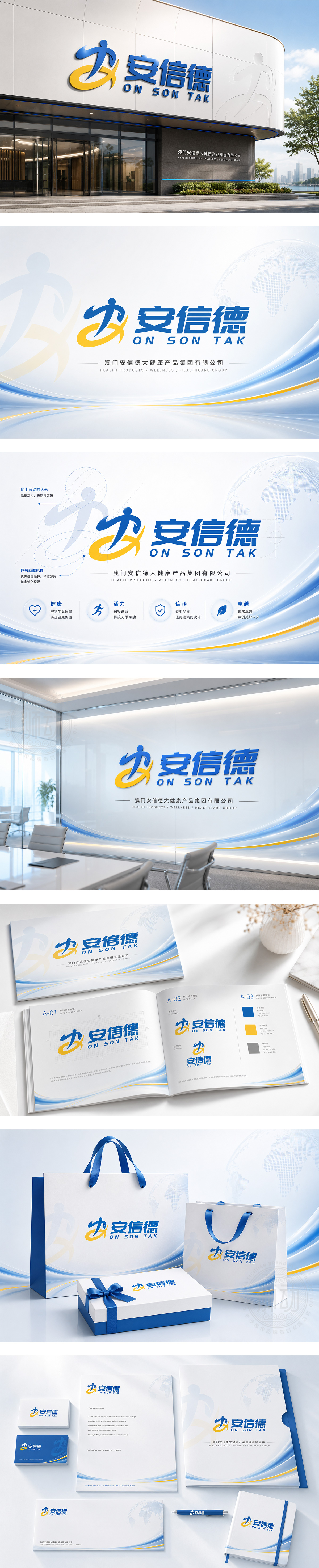
标志以“安信德”为核心,图形由蓝色抽象人形与黄色动感弧线巧妙构成。蓝色人形稳健有力,象征企业的以人为本与踏实前行;黄色弧线如阳光般环绕,寓意温暖、活力与持续上升的发展态势。二者结合形似“A”字(安),稳固且具张力,呼应“安全、信实、德尚”的品牌理念。主色调蓝黄对比鲜明,蓝色传递专业与信赖,黄色彰显活力与希望。整体设计简洁现代,动感十足,完美展现企业积极进取、稳健发展的品牌形象。
Centered on "Anxinde," the logo combines a blue abstract human figure with a dynamic yellow arc. The blue figure represents stability, humanity, and steady progress; the yellow arc, like a rising sun, symbolizes warmth, vitality, and upward momentum. Together they form an "A" shape (An), conveying strength and balance, echoing the brand values of Safety, Trust, and Integrity. The striking blue-yellow contrast communicates professionalism and optimism. Clean, modern, and energetic, the design perfectly captures the brand’s spirit of active advancement and reliable growth.




扫码或拨打添加客服微信


