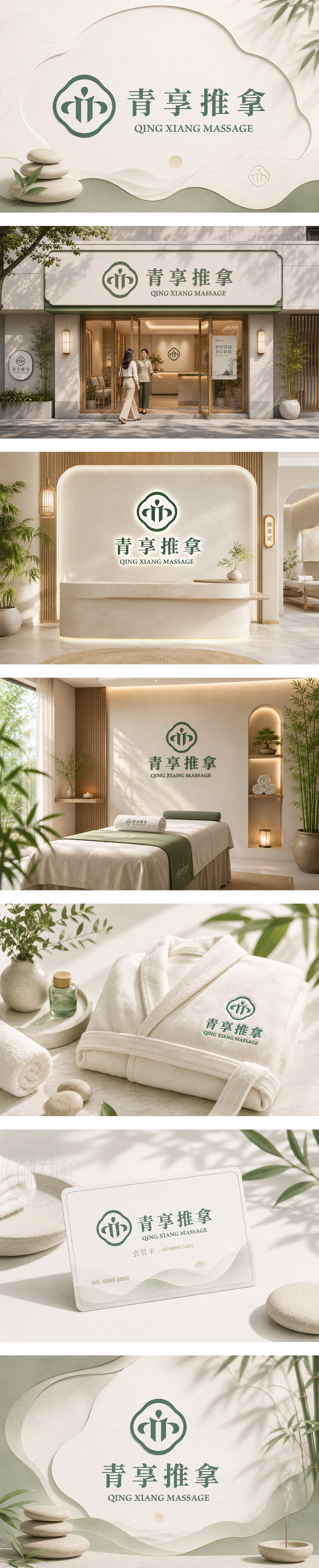
标志以“青享推拿”为核心,采用经典的手牌形外框,源自传统中式花窗与印章造型,赋予品牌浓厚的东方美学韵味。内部图形巧妙融合了人形与双手托举的姿态,直观展现了推拿理疗中“以人为本、舒缓身心”的专业服务理念。整体采用沉稳自然的绿色系,传递出健康、生机与宁静的疗愈感;底部字体的横线装饰点缀,增添了现代设计的稳重感。整体设计将传统中医养生底蕴与现代审美完美结合,彰显出品牌专业、舒适、值得信赖的服务形象。
Centered on "Qing Xiang Massage," the logo features a classic hand-shaped frame inspired by traditional Chinese lattice windows and seals, imbuing the brand with oriental aesthetics. The inner graphic cleverly integrates a human figure with hands in a supportive posture, intuitively conveying the professional service philosophy of "people-oriented" massage therapy. The natural green color palette evokes health, vitality, and tranquility. Subtle horizontal embellishments on the bottom text add a touch of modern stability. Perfectly blending traditional TCM heritage with modern design, the logo projects an image of professionalism, comfort, and trust.




扫码或拨打添加客服微信


