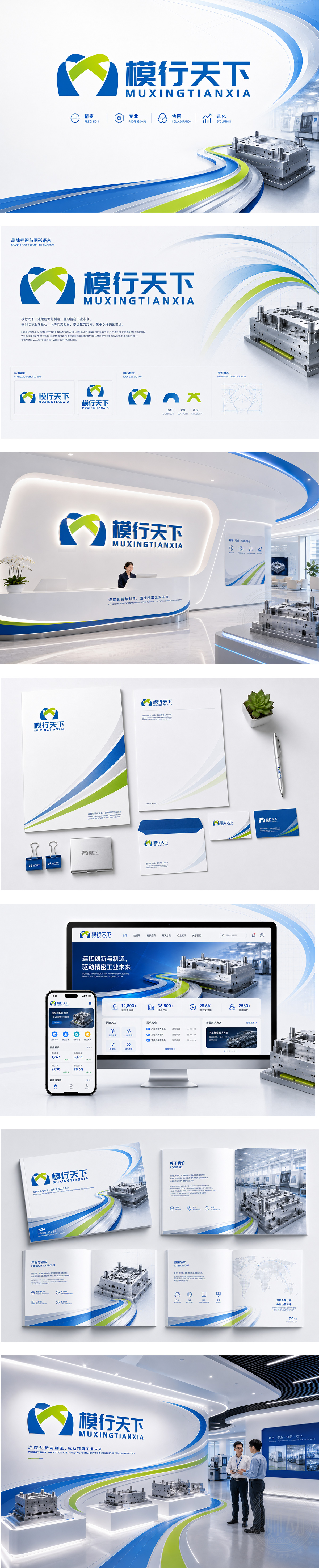
标志以品牌名“模行天下”为核心,图形部分巧妙地将字母“M”与“X”进行解构与重构:两侧对称的深蓝色块构成了稳固的字母“M”,象征扎实的基础与行业底蕴;中间穿插的亮绿色“X”则打破了沉闷,充满动感与科技感。一深一浅的色彩碰撞,既体现了稳健与创新的结合,又寓意着纵横交错的全球化视野。整体造型似展翅飞翔的飞鸟,传递出品牌立足根本、走向世界的宏大愿景。
Centered on "Muxing Tianxia," the logo cleverly deconstructs and reconstructs the letters "M" and "X." The symmetrical dark blue blocks form a solid "M," symbolizing a strong foundation and industry heritage, while the bright green "X" injects dynamism and a tech-savvy feel. The contrast between deep and light colors represents the fusion of stability and innovation, implying a global perspective. The overall shape resembles a soaring bird, conveying the brand's grand vision of establishing roots and expanding globally.




扫码或拨打添加客服微信


