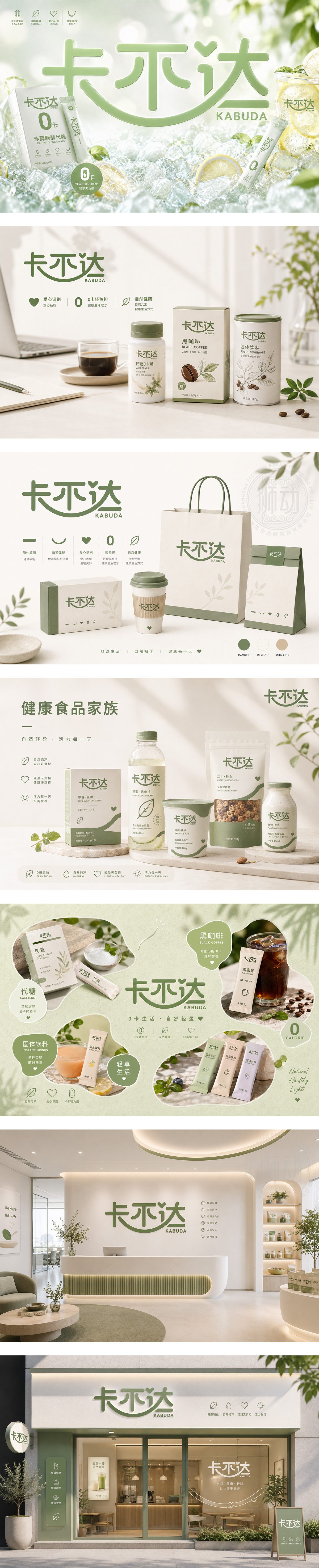
标志以品牌名“卡不达”为核心,采用圆润、粗壮的字体设计,赋予品牌极强的亲和力与稳重感。巧妙的是,“不”字上方自然融入了一个心形符号,既打破了字体的单调,又直观传递出用心服务、满载爱意的品牌温度。底部弧线如同一道微笑或地平线,象征着积极向上、连接四方。橄榄绿的运用,带来自然、健康与信赖的感受,整体设计生动活泼,完美契合了品牌追求快乐出行或温馨体验的定位。
Centered on the brand name "KABUDA," the logo features a rounded, bold typeface that gives the brand a strong sense of affinity and stability. Cleverly, a heart shape is integrated into the top of the character "Bu," breaking the monotony and intuitively conveying dedicated service and love. The bottom arc, resembling a smile or horizon, symbolizes positivity and connection. The use of olive green evokes feelings of nature, health, and trust. The overall design is lively and playful, perfectly matching the brand's positioning for happy travel or warm experiences.




扫码或拨打添加客服微信


