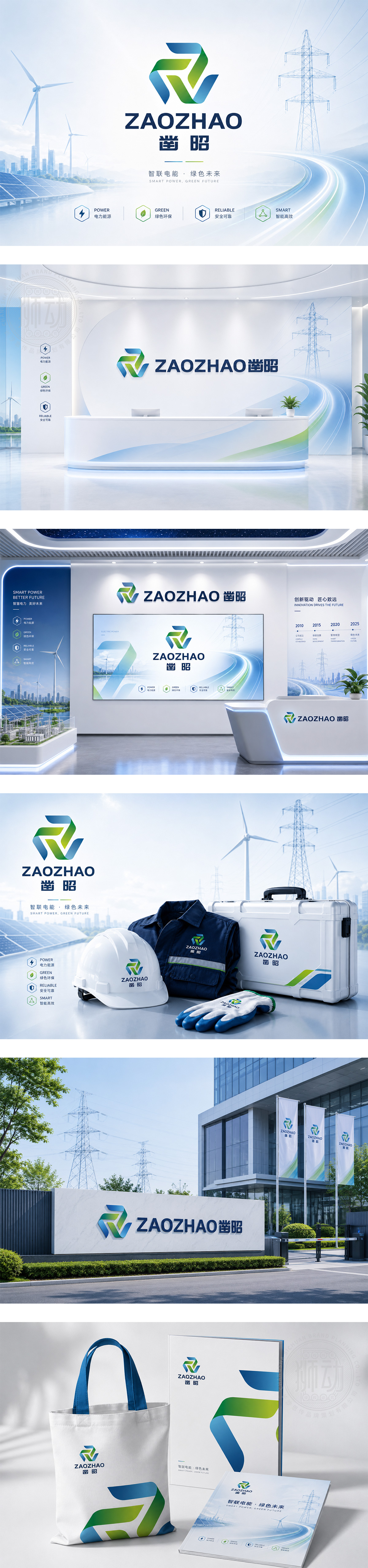
标志以品牌名首字母“Z”为视觉核心,通过几何切割与交错,构建出“凿”的动态意向与“昭”的光明意象。图形左侧的蓝色块面象征深邃的科技与理性,右侧的绿色体块则代表生机与创新,两者交织形成稳固的三角结构,寓意企业脚踏实地、锐意进取。整体设计现代、硬朗,色彩对比鲜明,完美诠释了品牌在科技领域中不断探索、终见光明的品牌精神。
Centered on the initial "Z," the logo uses geometric cuts to create the dynamic motion of "Chiseling" and the brightness of "Illumination." The blue block on the left symbolizes deep technology and rationality, while the green mass on the right represents vitality and innovation. Their interweaving forms a solid triangular structure, implying a down-to-earth and enterprising spirit. Modern and sharp, the design perfectly interprets the brand's journey of exploring in the tech field towards a bright future.




扫码或拨打添加客服微信


