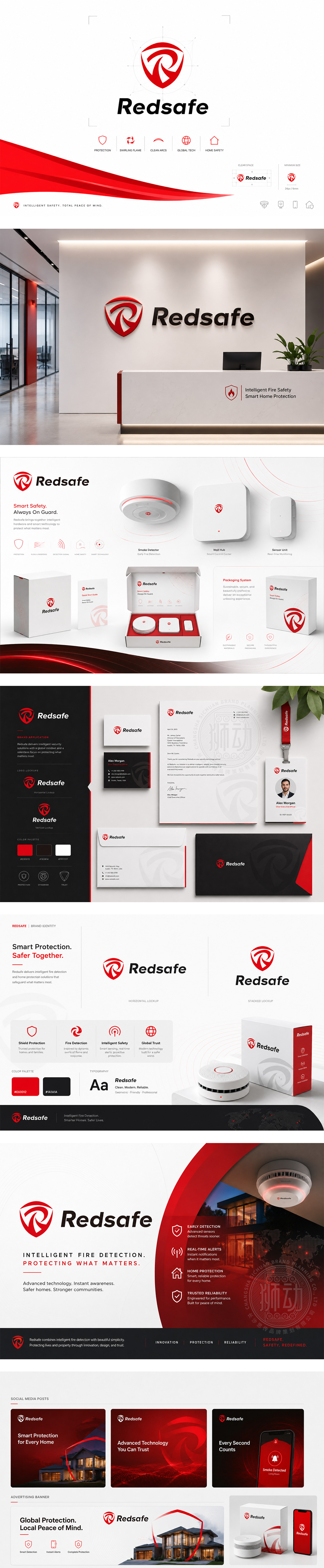
标志以“安全守护”为核心理念,将字母“R”巧妙融入盾牌造型中,象征着坚固、可靠的防护屏障与值得信赖的品牌承诺。红色的运用不仅呼应品牌名称中的“Red”,更传递出热情、警示与高效的特质;内部的旋转负形设计赋予图形动态感,寓意企业在安全防护领域的不断进取与循环守护。整体设计简洁有力,视觉冲击力强,完美诠释了Redsafe在行业中提供坚实保障的专业形象。
Grounded in "Safety Guardianship," the logo ingeniously integrates the letter "R" into a shield, symbolizing a solid, reliable protective barrier and a trustworthy brand promise. The red hue echoes the brand name while conveying passion, alertness, and efficiency. The internal rotating negative space adds dynamism, representing the company's continuous progress and cyclical protection. Clean, powerful, and visually striking, the design perfectly captures Redsafe's professional image of providing robust security.




扫码或拨打添加客服微信


