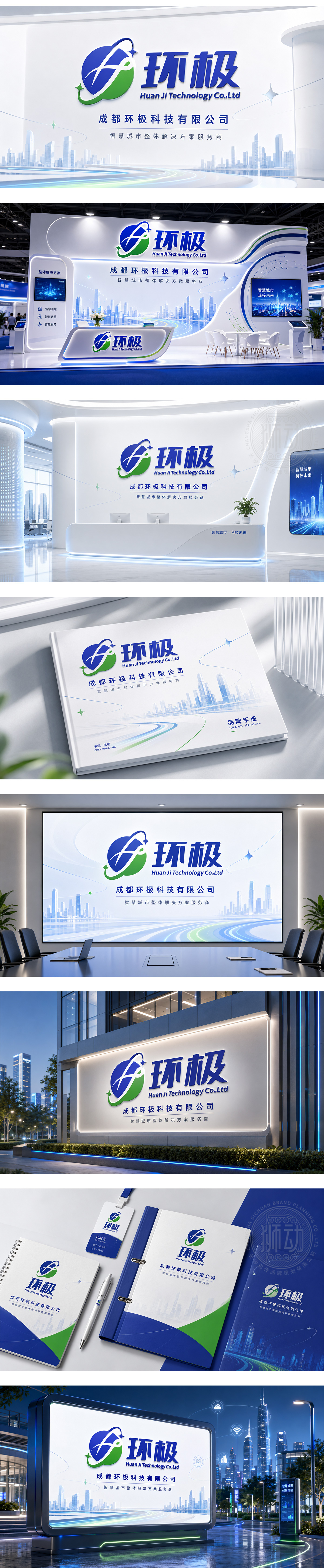
标志以“环极”的品牌首字母“H”与“J”为创意原点,通过流畅的线条交织与变形,构建出一个形似地球经纬网的图形,寓意企业立足全球、连接无限可能的宏大格局。字母的负空间巧妙勾勒出环绕的绿叶形态,生动传达了绿色环保、可持续发展的科技理念。深蓝代表科技的深邃与专业,绿色象征生态与活力,整体设计现代简约,完美契合了科技企业探索未来、守护地球的核心理念。
The logo originates from the initials "H" and "J" of "Huan Ji," intertwined to form a globe-like grid, symbolizing a global vision and infinite connectivity. The negative space subtly outlines a surrounding green leaf, conveying the concept of eco-friendly and sustainable technology. Deep blue represents technological depth and professionalism, while green signifies ecology and vitality. The modern, minimalist design perfectly aligns with the brand's mission to explore the future while safeguarding the planet.




扫码或拨打添加客服微信


