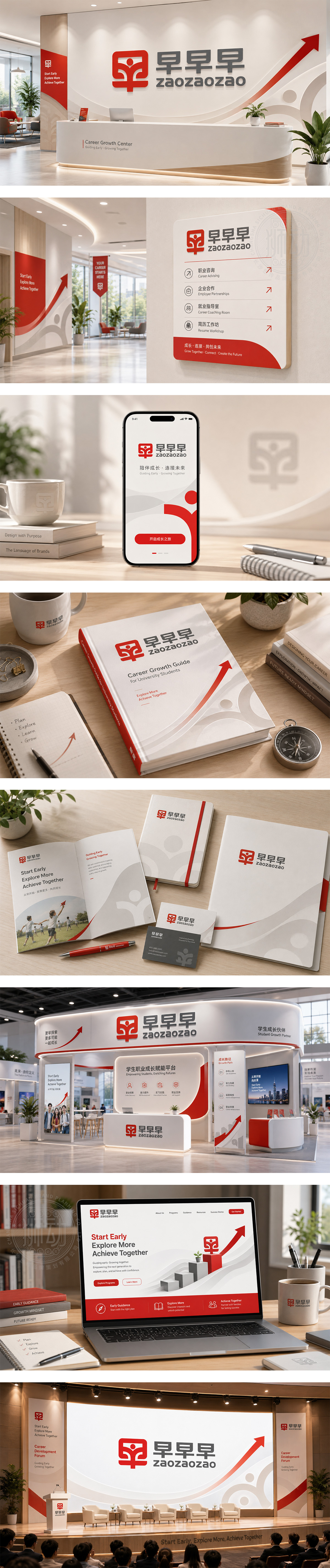
标志以品牌名“早”字为核心创意,通过正负形的艺术处理,巧妙地将三个“早”字融合成一个整体。左侧红色图形中,白色人形张开双臂,仿佛迎接初升的朝阳,寓意着朝气蓬勃与无限的希望。右侧三个灰色“早”字的重复排列,不仅强化了品牌记忆,更传递出“早起、早行、早达”的进取精神。红灰配色经典明快,整体设计兼具趣味性与识别度,完美诠释了品牌充满活力与效率的核心理念。
Centered on the Chinese character "Morning," the logo integrates three characters into one through positive and negative space art. The white figure within the red graphic embraces the rising sun, symbolizing vitality and hope. The repeated gray characters reinforce brand recall while conveying the enterprising spirit of "rise early, act early, succeed early." The classic red-gray palette is lively and iconic, perfectly capturing the brand's energetic and efficient core values.




扫码或拨打添加客服微信


