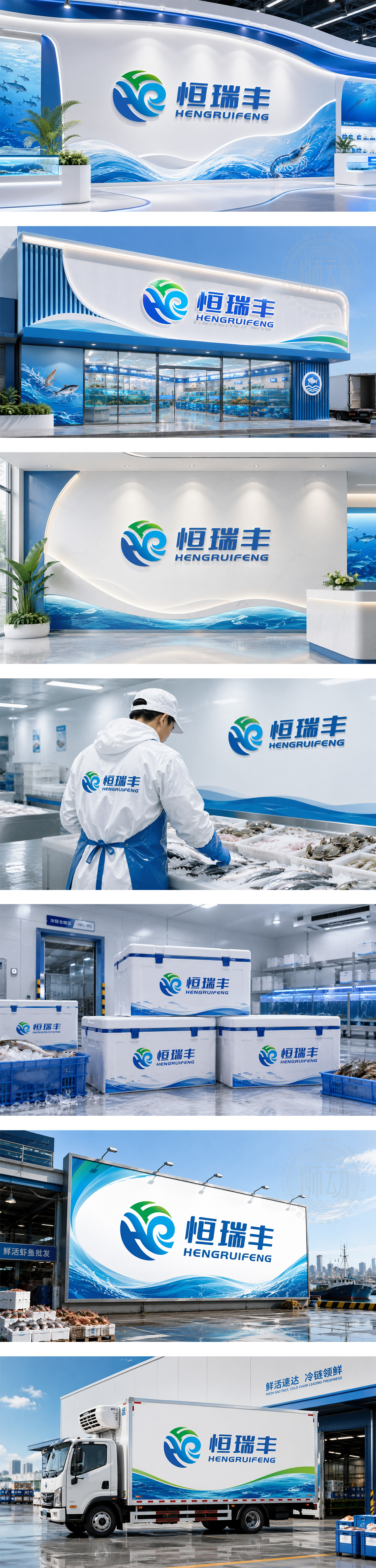
标志以品牌首字母“H”与“R”为设计骨架,通过艺术化的变形与融合,构建出一个循环流动的太极式图形,寓意企业与自然和谐共生、基业长青。图形巧妙结合了蓝色的水波与绿色的生机,如浪花翻涌,似新芽破土,象征资源的可持续发展与源源不断的创新动力。整体造型圆润饱满,视觉平衡感强,精准传达了“恒瑞丰”稳健经营、福泽绵长的品牌理念。
The logo uses the initials "H" and "R" as its framework, artistically merging them into a circulating Tai Chi-like shape, symbolizing harmony between the enterprise and nature, and everlasting growth. The design cleverly integrates blue water waves with green vitality, resembling surging waves and sprouting buds, representing sustainable resources and endless innovation. Its round and balanced form perfectly conveys HENGRUIFENG's philosophy of steady operation and enduring prosperity.




扫码或拨打添加客服微信


