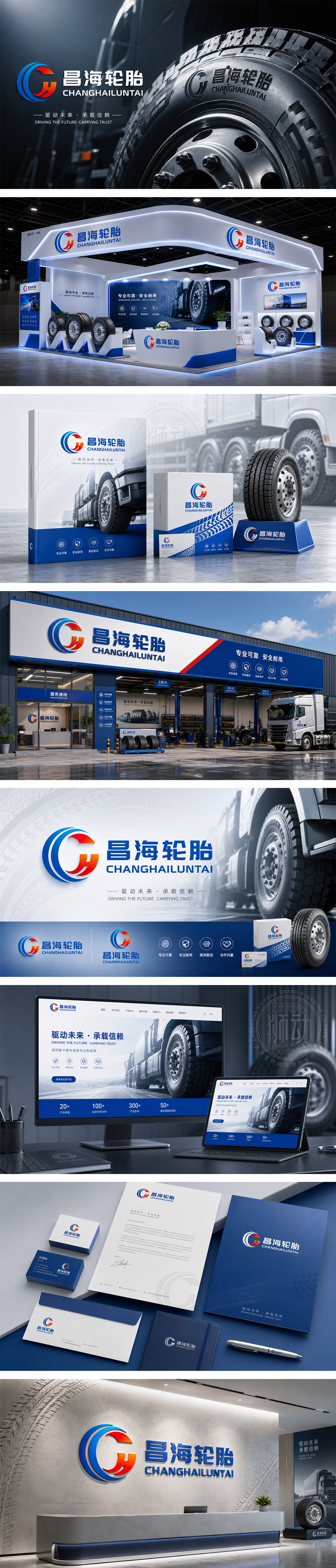
标志巧妙融合首字母“C”与“H”,构建出高速旋转的轮胎动势。深海蓝主调奠定稳健可靠的专业基石,炽热红渐变注入速度与激情,寓意品牌动力澎湃。流畅线条不仅勾勒出轮胎的抓地轨迹,更象征昌海轮胎在多元路况下的卓越操控与安全护航,尽显国际视野。
Merging "C" and "H" into a high-speed rotating tire, the logo uses deep blue for reliability and red gradients for speed. Smooth lines outline the tire's grip trajectory, symbolizing excellent handling and safety. It reflects the brand's international vision and robust performance across all terrains.




扫码或拨打添加客服微信


