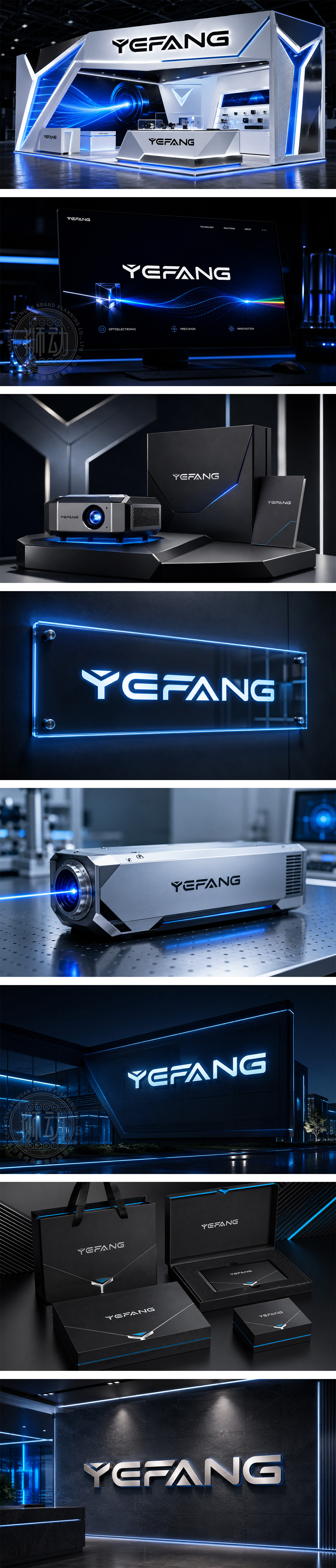
标志以定制几何体无衬线字体为核心,通过大量锐角转折与斜切笔画,模拟光束折射与电子线路轨迹,将光电物理特性转化为视觉语言。全直线构成的硬朗轮廓,彰显硬核科技与极致严谨的工业气质;“F”与“A”的波峰状处理,暗喻信号的高频传输与企业的攀升态势。纯黑底色赋予品牌深沉、专业的信赖感,完美诠释光电领域的先锋精神。
The custom geometric sans-serif logotype uses sharp angles and diagonal cuts to mimic light refraction and circuit paths, translating optoelectronic physics into visual language. Its rigid, linear contour conveys hardcore rigor, while peak-like strokes imply high-frequency signal transmission. The pure black tone ensures professionalism, perfectly interpreting the pioneering spirit of the optoelectronics industry.




扫码或拨打添加客服微信


