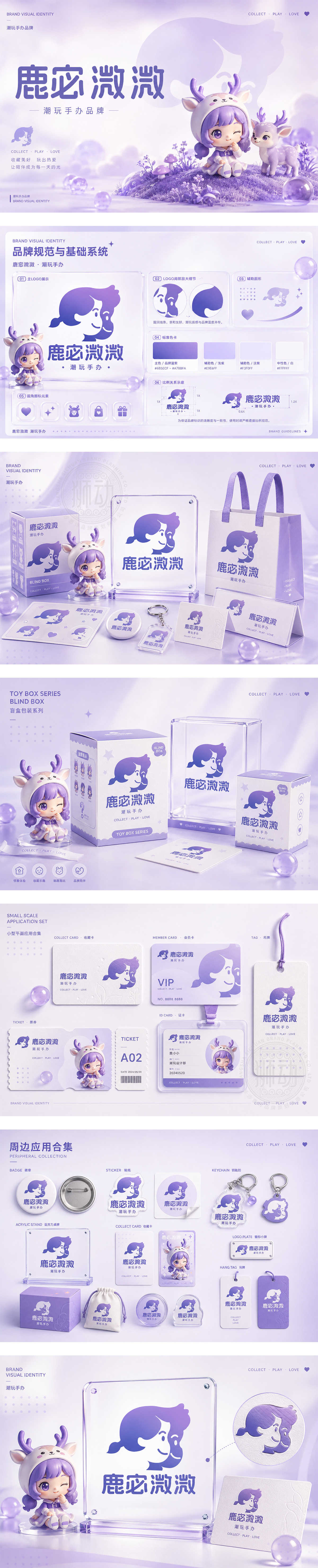
标志以正负形的巧妙构图,将女孩侧脸与微笑表情合二为一,赋予品牌拟人化的情感联结与“面对面”的互动趣味。主色调选用梦幻香芋紫,打破常规高饱和配色,传递神秘、治愈的独特气质,精准锁定Z世代审美。圆润饱满的定制字体,如手办般扎实可爱,整体构建出软萌、亲和、极具辨识度的潮玩IP形象。
The logo utilizes negative space to merge a girl's profile with a smiling face, creating a personified interaction. The signature mauve purple breaks conventional palettes, conveying a mysterious and healing vibe for the Gen Z market. Paired with chunky, rounded typography, the design establishes a cute, affectionate, and highly recognizable IP identity.




扫码或拨打添加客服微信


