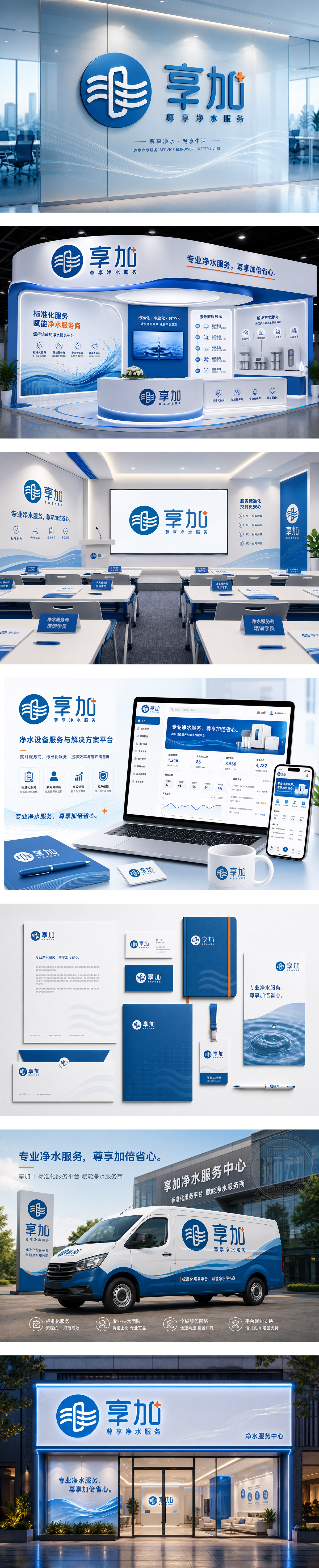
标志以双手托举水滴为视觉核心,具象化诠释净水服务“用心呵护、输送好水”的本质,传递对纯净水质的坚守。主色调深蓝象征专业、深邃与信赖感,契合净水行业的安全属性;活力橙“+”号点睛,寓意健康价值的加乘与服务的不断升级。字体采用圆角处理,刚柔并济,在稳重中流露亲和力,整体构建出一个值得托付的安全、专业、增值的净水品牌形象。
The logo features hands cradling a water droplet, symbolizing the brand's dedication to delivering pure water with care. Deep blue conveys professionalism and trust, while the vibrant orange "+" signifies added health value. Rounded typography softens the robust structure, creating a reassuring and approachable identity for a reliable water service provider.




扫码或拨打添加客服微信


