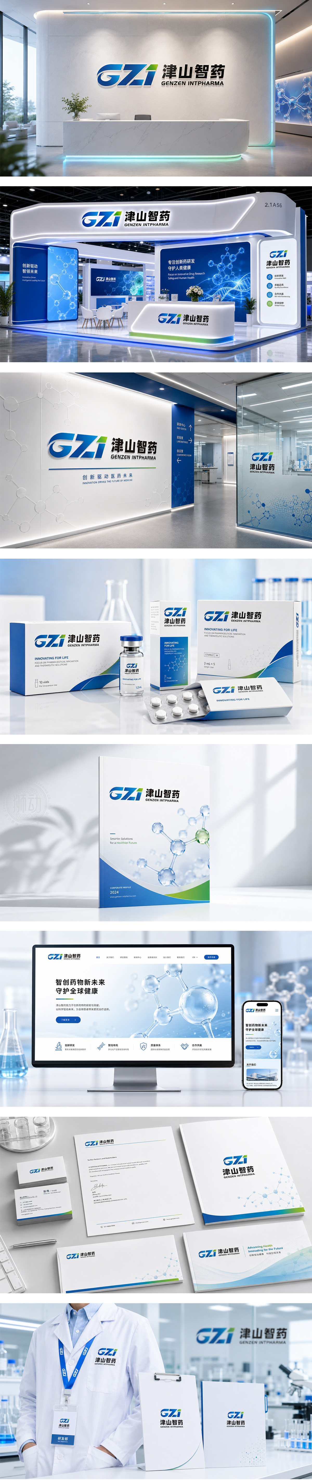
狮动设计将“G”、“Z”、“i”三个字母进行了连笔和重构,字母“G”的开口向右,配合“Z”和“i”的倾斜角度,形成了一种强烈的向前冲刺的动势。这在商业语境中通常隐喻着“速度”、“高效”和“创新”,非常符合医药研发追求效率、争分夺秒的行业特征主色调采用了深邃的科技蓝。在品牌设计中,蓝色通常代表理性、严谨、科技和信任,成功地塑造了一个“既有科技硬实力,又有生命关怀”的现代化智能制药企业形象。
Lion design Lian Bi and reconstructs the letters "G", "Z" and "I". The opening of the letter "G" is to the right, and with the inclination angles of "Z" and "I", it forms a strong momentum to sprint forward. This is usually a metaphor for "speed", "efficiency" and "innovation" in the business context, which is very in line with the industry characteristics of pursuing efficiency and racing against time in pharmaceutical research and development. In brand design, blue usually represents rationality, preciseness, science and technology and trust, which has successfully shaped the image of a modern intelligent pharmaceutical enterprise with both scientific and technological hard power and life care.




扫码或拨打添加客服微信


