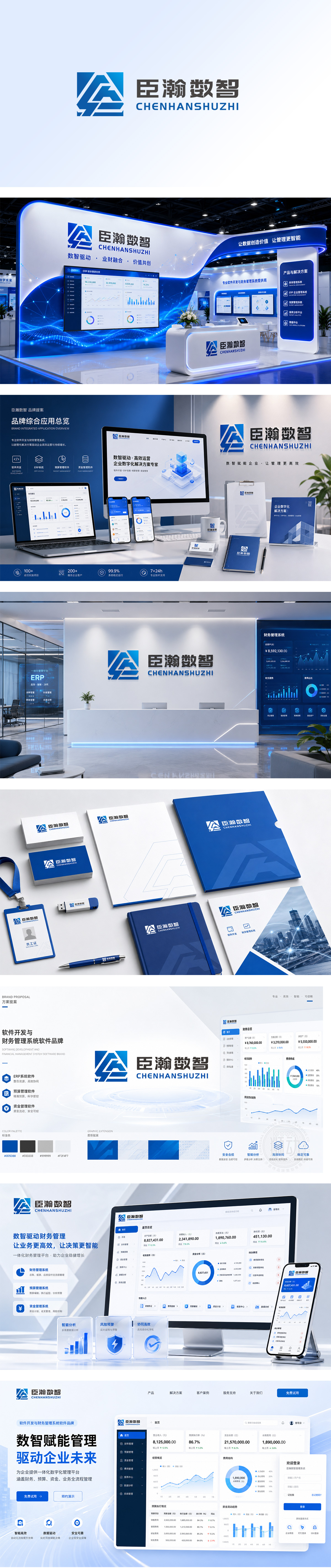
狮动设计将字母进行了立体化、几何化的拼接。这种设计既保留了字母的识别基础,又通过抽象变形创造了独特的视觉符号,具有很高的辨识度。立体感与空间感:图形采用了类似“不可能图形”或折纸艺术的立体透视效果。这种三维的空间感暗示了企业业务的深度(数据挖掘)和广度(多维视角),同时也让平面的Logo显得更有质感。动态与连接:图形的线条相互穿插、咬合,形成了一种流动的动态感。这象征着数据的流动、信息的交互以及万物互联的概念,非常符合“数智”行业的属性。通过抽象的几何语言,成功地将“连接、数据、科技、稳健”这些抽象概念具象化了,是一个成熟且具有商业价值的企业标识设计。
Lion design combines the letters in a three-dimensional and geometric way. This design not only retains the recognition basis of letters, but also creates unique visual symbols through abstract deformation, which has high recognition. Three-dimensional sense and sense of space: the figure adopts a three-dimensional perspective effect similar to "impossible figure" or origami art. This three-dimensional sense of space implies the depth (data mining) and breadth (multi-dimensional perspective) of enterprise business, and at the same time makes the plane Logo look more textured.
Dynamic and connection: the lines of the figure are interspersed and meshed with each other, forming a sense of dynamic flow. This symbolizes the flow of data, the interaction of information and the concept of the internet of everything, which is very consistent with the attributes of the "digital intelligence" industry.




扫码或拨打添加客服微信


