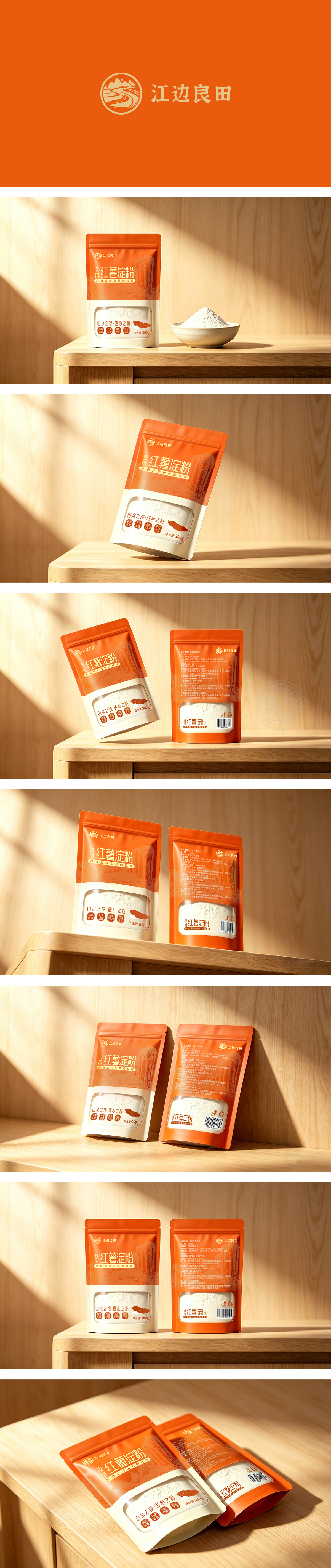
狮动设计采用包装上半部分选用了非常纯正、温暖的橙红色。这种颜色直接对应了产品原料——红薯的色泽。消费者看到这种颜色,潜意识里就会联想到红薯的香甜和温暖,极大地增强了食欲感。对比产生视觉冲击:橙红色与下半部分的纯白色形成了鲜明的对比。橙色代表活力和原料,白色代表纯净和粉末状成品(淀粉)。这种“上橙下白”的配色既符合产品逻辑,又在视觉上非常醒目,让人在货架上一眼就能注意到。不仅仅是在做一个“袋子”,而是在讲一个关于“纯净、天然、高品质”的故事。它通过色彩唤醒味觉,通过开窗建立信任,通过排版引导视线,最终成功地将一个普通的农产品(淀粉)包装出了“伴手礼”般的精致感。
Lion design uses a very pure and warm orange-red color in the upper part of the package. This color directly corresponds to the color of sweet potato, the raw material of the product. When consumers see this color, they will subconsciously think of the sweetness and warmth of sweet potatoes, which greatly enhances their appetite.Contrast has a visual impact: orange red is in sharp contrast with the pure white in the lower part. Orange represents vitality and raw materials, and white represents pure and powdery finished products (starch). This "orange on the top and white on the bottom" color scheme is not only in line with the product logic, but also very eye-catching visually, which makes people notice it at a glance on the shelf. Not just making a "bag", but telling a story about "purity, nature and high quality".




扫码或拨打添加客服微信


