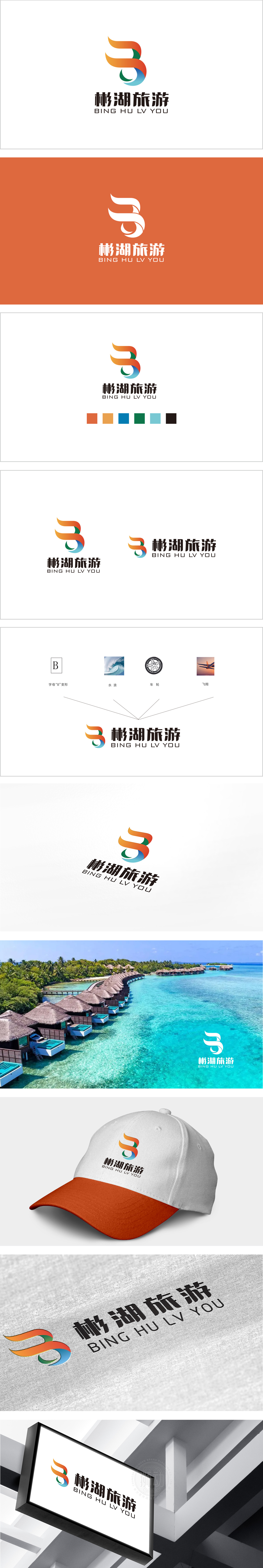
狮动设计以抽象的飘带/波浪形态构成,线条流畅且富有动感,形似数字“3”又暗含“湖”的意象:曲线的动态感:传递出旅游带来的自由、愉悦与探索欲,暗合“行走在路上”的旅游核心体验。“湖”的隐形符号:巧妙点出“彬湖”的地域属性,整体结构的平衡感:传递出品牌希望成为游客与目的地之间纽带的愿景。设计既展现了对“旅游”行业本质(体验、自然、情感)的理解,也精准呼应了“彬湖”的地域属性,是兼具美学价值与品牌战略意义的优质视觉符号。
Liondesign is composed of abstract ribbon/wave shape, with smooth and dynamic lines. It looks like the number "3" and implies the image of "lake": the dynamic sense of curve conveys the freedom, pleasure and desire for exploration brought by tourism, which coincides with the core experience of "walking on the road". The invisible symbol of "Lake": cleverly point out the regional attribute of "Bin Lake" and the sense of balance in the overall structure; convey the vision that the brand hopes to become a link between tourists and destinations.


扫码或拨打添加客服微信


