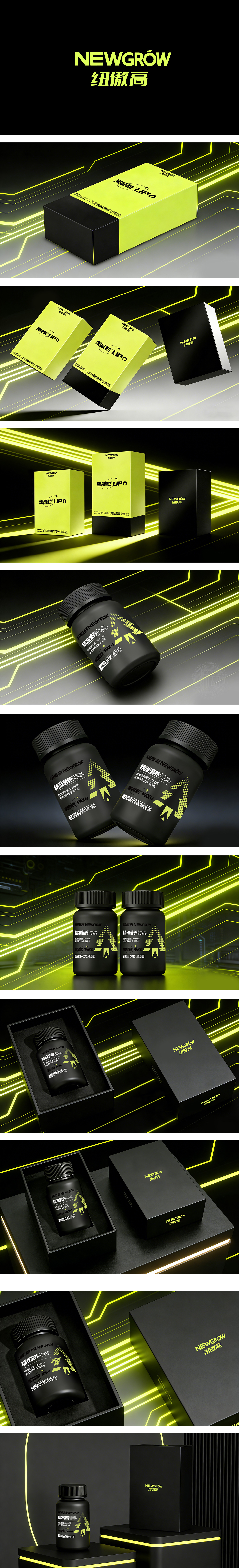
狮动设计采用黑黄撞色的“视觉冲击+属性暗示”,主色:黑——代表专业、高端,符合运动补剂“实力派”的质感定位;荧光黄——这是运动、能量、科技的经典用色,高饱和度的黄与黑形成强对比,瞬间抓住注意力;更妙的是,黄色刚好呼应了“黑能粒™MAX”中的“能量感”,仿佛在暗示“服用后能爆发活力”。A字被拆解为“箭头+点状矩阵”——箭头象征“突破、前进”,点状矩阵像“数据颗粒”;“三角切角”和“渐变点状”,模拟了“电流流动”的视觉效果,强化了“科技赋能营养”的概念,让“黑能粒™MAX”不再是抽象的名词,而是能“看得到的能量”。不仅养眼,更能“卖货”!
Lion design adopts "visual impact+attribute suggestion" with black and yellow contrasting colors.Main color: black-representing professionalism and high-end, in line with the texture orientation of sports tonic "strength school"; Fluorescent yellow-this is a classic color for sports, energy and technology. The yellow with high saturation forms a strong contrast with black, which instantly grabs attention; Even better, yellow just echoes the "energy sense" in "Black Energy ™MAX", as if suggesting that "it can burst into vitality after taking it". The word A is disassembled into "arrow+dot matrix"-the arrow symbolizes "breakthrough and progress" and the dot matrix is like "data particles"; "Triangular cutting angle" and "gradual point shape" simulate the visual effect of "current flow", strengthen the concept of "technology-enabled nutrition", and make "black energy particle ™MAX" not an abstract term, but "visible energy". Not only eye-catching, but also "selling goods"!.


扫码或拨打添加客服微信


