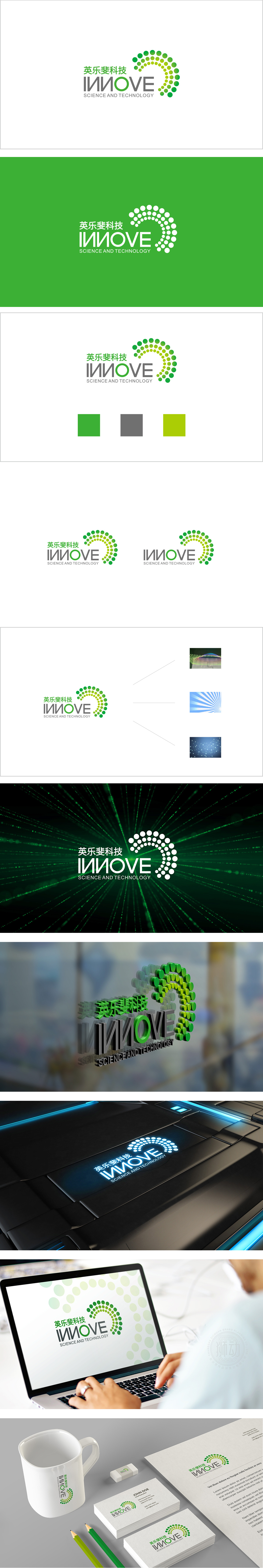
狮动设计采用绿色渐变圆点组成的半环形曲线,既像DNA双螺旋的局部抽象,又像声波/信号的扩散(象征科技的传播与连接),整体呈现旋转上升的动态感,传递“创新”与“进步”的品牌理念。绿色是医疗、健康、环保领域的经典配色,传递安全、专业、生命力;圆点的渐变处理,隐喻“科技赋能生命的多元可能性”。既通过动态曲线和绿色调关联了“医疗/健康”的柔和属性,又以圆点阵列和环形结构体现了“科技的秩序与创新”,从视觉符号到行业联想。
Lion design adopts a semi-circular curve composed of green gradual dots, which is not only like the partial abstraction of DNA double helix, but also like the diffusion of sound waves/signals (symbolizing the spread and connection of science and technology), showing a dynamic sense of rotation and rising as a whole, and conveying the brand concept of "innovation" and "progress". Green is a classic color matching in the fields of medical treatment, health and environmental protection, conveying safety, professionalism and vitality.


扫码或拨打添加客服微信


