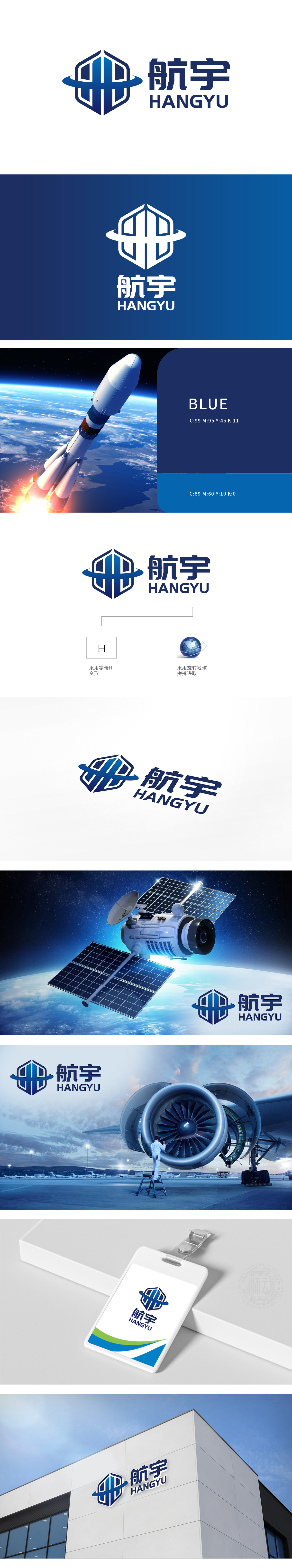
狮动设计以六边形本身就是航天领域的“经典符号”(比如卫星的结构、航天材料的晶格),自带“坚固、可靠、抗冲击”的联想,盾牌内部的对称竖条+中间镂空设计,其实是“航”字的变形——既保留了品牌名称的识别性,又用极简线条模拟了航天器材的“结构感”。环绕盾牌的蓝色曲线带是神来之笔!它像卫星绕地球的轨道,像火箭推进的轨迹,更像航天事业“连接天地、探索未知”的核心使命。整体用抽象的航天符号(六边形、轨道、对称结构)和色彩,把“航天器材”的本质(可靠、精准、探索)用视觉语言“翻译”出来。
Liondesign is a "classic symbol" in the aerospace field (such as the structure of satellites and the lattice of aerospace materials) with its own association of "firmness, reliability and impact resistance". The symmetrical vertical bar inside the shield+hollow design in the middle is actually the deformation of the word "aviation"-it not only retains the recognition of the brand name, but also simulates the "structural sense" of aerospace equipment with minimalist lines. The blue curved belt around the shield is a stroke of genius! It is like the orbit of a satellite around the earth, like the trajectory of a rocket, and more like the core mission of the space industry to "connect heaven and earth and explore the unknown". The essence of "space equipment".


扫码或拨打添加客服微信


