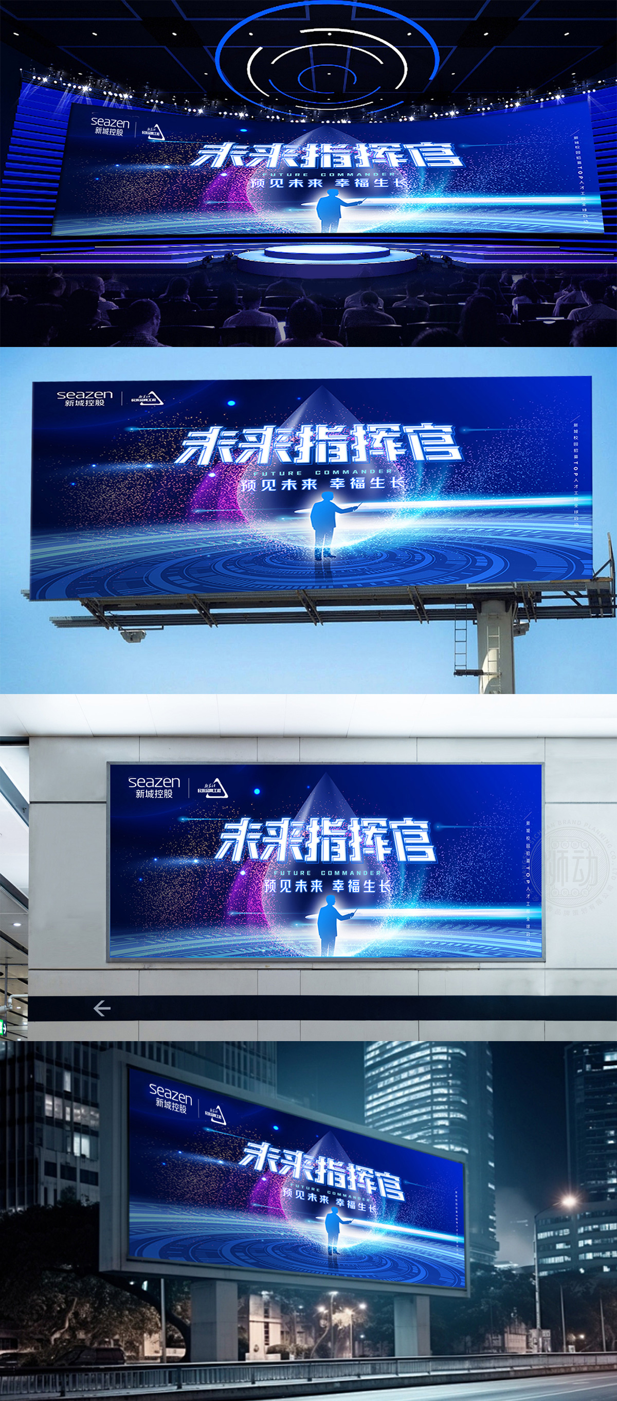
狮动为seazen新城控股设计的品牌logo,以深蓝色背景传递稳重与专业感,将“seazen”英文与“新城控股”中文以简约字体组合,凸显国际化与本土根基的融合。右侧三角形符号巧妙融入“新华社民族品牌工程”标识,既彰显权威合作背景,又以几何线条赋予现代动感。设计精准契合房地产行业特性,将品牌理念与视觉符号深度结合,展现狮动对品牌战略与美学创新的双重把控力。
The brand logo designed by Lion Motion for seazen New Town Holdings conveys a sense of stability and professionalism with a dark blue background, and combines "seazen" English and "New Town Holdings" Chinese with simple fonts, highlighting the integration of internationalization and local roots. The triangle symbol on the right is ingeniously integrated into the logo of "Xinhua National Brand Project", which not only shows the authoritative cooperation background, but also gives modern dynamics with geometric lines. The design accurately fits the characteristics of the real estate industry, deeply combines the brand concept with visual symbols, and shows the dual control of Lion Motion on brand strategy and aesthetic innovation.


扫码或拨打添加客服微信


