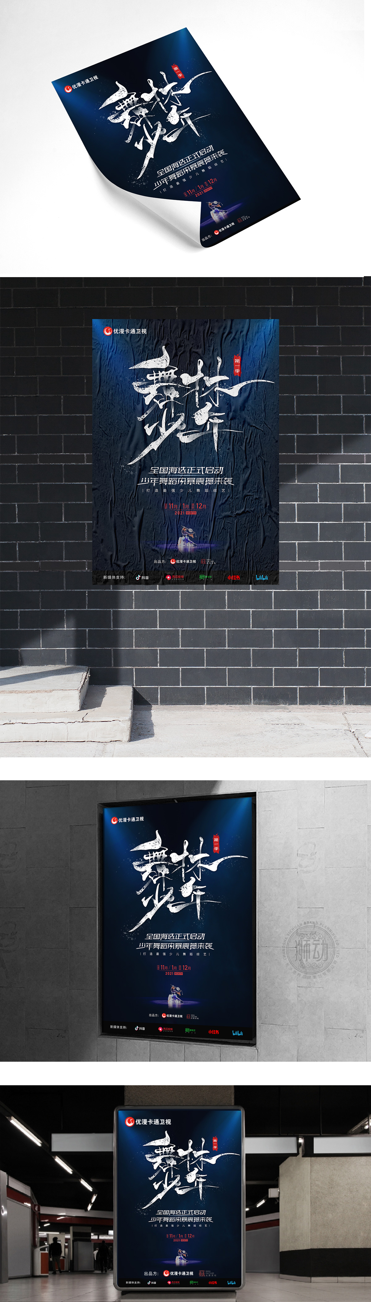
舞林少年第一季全国海选LOGO由狮动设计团队倾力打造。项目核心在于传递少年舞蹈的活力与专业感,我们精准捕捉“舞蹈动态”与“少儿综艺”的定位,以流线型书法字体呈现“舞林少年”四字,如舞者跃动般充满张力;深蓝背景搭配红色标签,既彰显神秘专业气质,又注入青春活力。客户对设计方案高度认可,认为LOGO完美契合品牌调性,视觉冲击力与辨识度极佳,助力海选活动迅速吸引目标受众关注。狮动以创意与专业,为品牌打造独到视觉符号,赋能项目成功落地!
The LOGO of the national sea election in the first season of Wulin Youth was created by the lion design team. The core of the project is to convey the vitality and professionalism of juvenile dance. We accurately capture the positioning of "dance dynamics" and "children's variety", and present the word "dancing youth" in a streamlined calligraphy font, which is as full of tension as a dancer. The dark blue background with red label not only shows mysterious professional temperament, but also injects youthful vitality. Customers highly recognize the design scheme, and think that LOGO perfectly fits the brand tonality, with excellent visual impact and recognition, which helps the sea election activities quickly attract the attention of the target audience.


扫码或拨打添加客服微信


