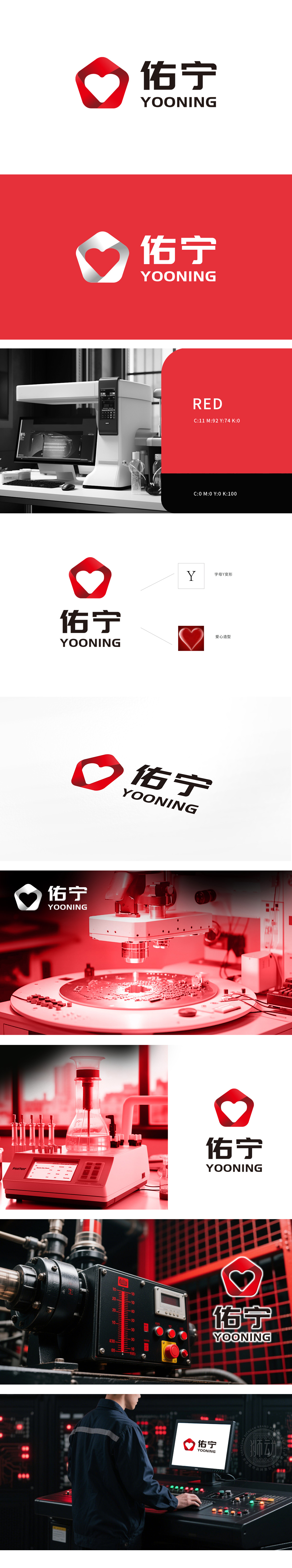
狮动设计受佑宁公司委托,为其打造极具辨识度的品牌logo。我们以温暖与专业为核心,将红色心形与“Y”字母创意融合,既传递关怀理念,又以简约线条彰显现代质感。标志中的“YOONING”英文搭配,提升国际感,整体设计在白色背景衬托下更显醒目。新LOGO上线后,佑宁在供应链展会、政企合作中辨识度跃升,称“从LOGO读懂‘技术硬实力+服务暖心力’”——狮动用设计为品牌架起“专业信任”与“情感认同”的桥梁,让视觉成为拓客新名片.
Lion Motion Design is entrusted by Youning Company to create a highly recognizable brand logo for it. With warmth and professionalism as the core, we creatively combine the red heart with the letter "Y", which not only conveys the concept of care, but also demonstrates the modern texture with simple lines. The English collocation of "YOONING" in the logo enhances the international sense, and the overall design is more eye-catching against the white background. After the launch of the new LOGO, Youning's recognition in supply chain exhibitions and government-enterprise cooperation jumped, and many new customers said that "reading' technical hard power+service warm heart' from LOGO"-Lion uses design to build a bridge between "professional trust" and "emotional identity" for industrial brands, making vision a new business card for pioneering customers.


扫码或拨打添加客服微信


